Icons
This chapter contains various sets of static or animated icons for all application areas. We prefer to use icons rather than illustrations when designing our media. Why? Icons are more immediately recognisable. They are directly associated with specific themes or circumstances. Therefore, please assign the icons to the appropriate content as accurately as possible.
Reflex Icon Set
The stylistic idiom for Reflex icons is inspired by our in-house font FF Netto Pro; the corners are rounded and we prefer a 2D presentation rather than 3D. If you cannot find the icon you need in the icon set, please send an email to marketing@reflex.de.
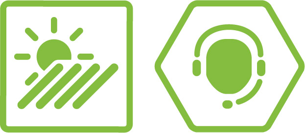
The frames give the icons context and, in addition to this, define the area they belong to.
A square frame should generally be used. Here, icons indicate, for example, application areas for our products.<br/> Hexagonal icons are only to be used in the After Sales & Service area and make use of the basic design of the visuals and the honeycomb shape.
In principle, all our icons can be used without a frame.
You can use all the icons in the four colourways shown here, but please use the main version as your first option! This is the 2D icon in Reflex green with the frame as the outline.
To make a specific topic stand out, you can highlight communication-related and product-related icons (area 3 and 4) in orange. This is particularly relevant for calculation examples in, for example, product brochures or price lists.


")
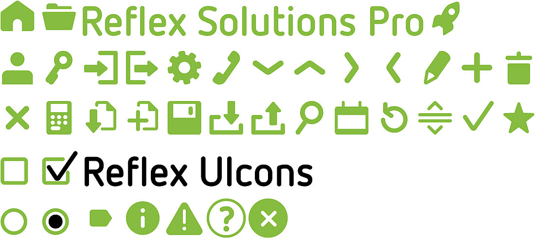
Reflex UIcons
The Reflex animated icons are primarily intended for use in user interfaces. A detailed description can be found in the Reflex Solutions Pro chapter.
The icon set can be requested.