Our Logo
The classic diaphragm expansion vessel is part of the Reflex DNA. Our logo traces the outline of an expansion vessel and makes it its own: with rounded corners and a clean, clear shape. We want to communicate our heritage, our down-to-earth approach, combined with outstanding expertise. The rounded corners indicate that we are open and minded.
The Reflex lettering continues this stylistic idiom. The x is particularly striking as it is open top and bottom, like a vessel. We also write the brand name reflex in lower case to emphasise our openness. The lettering is positioned asymmetrically on a white background on the green, stylised expansion vessel. This creates an empty space to the right – in a sense, this is the exciting path our work takes us on every day to something new!
The logo and lettering form the roof for our Thinking Solutions approach, our intuitive business strapline. It completes our heritage, expertise and dynamism as shown through our logo and lettering. Thinking Solutions means: we think in solutions. We look at relationships, connections and details. Our strapline is always in English, wherever it is used in the world.
We will provide you with easy-to-use templates for our Reflex logo. Information on how to use the logo correctly is provided below. Thank you for following these rules and thus contributing to maintaining a consistent and recognisable presence for Reflex throughout the world.
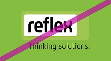
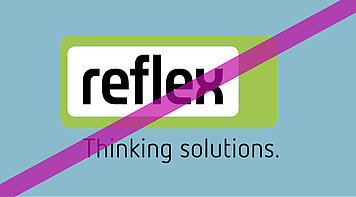
Colourways
Size
White Space
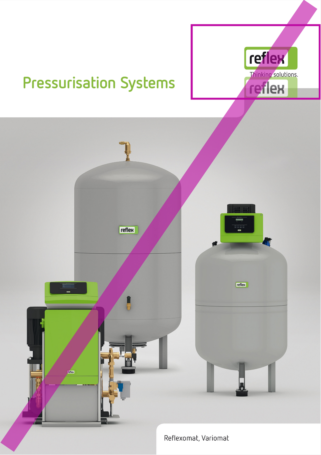
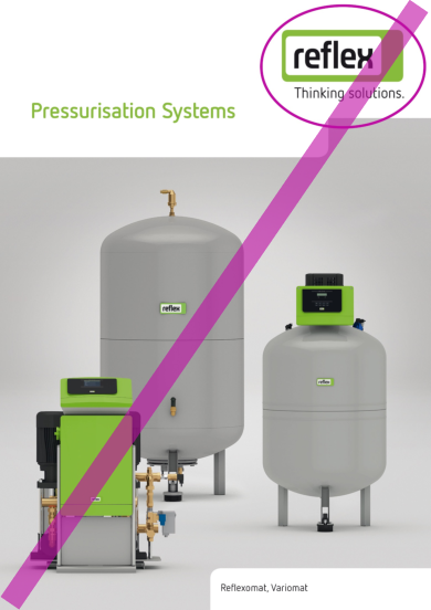
To ensure our logo is recognisable, it must have its own white space – in other words, a minimum distance to all other graphic elements surrounding the logo.
A more detailed overview of the logo sizes and distances for the most frequently used DIN formats is available in Sizes and distances - overview.
In all digital media where it is not possible to adhere to the white space specified for print of logo height or logo width, the ‘r’ dimension should be used. This means: the logo is surrounded on all sides by a white space which is the same size as the ‘r’ in reflex. A further important difference to print is that the logo is always used left-justified in digital media.
Sizes and Distances – Overview
Large, medium or small? The following table provides the correct logo sizes and distances for the most commonly used DIN formats at a glance.
The height of the logo is not shown here as it is automatically generated as a function of the width. The slight variation in the values is a result of the fact that the full stop in the strapline extends slightly beyond the logo itself.
| Format | Logo width | Distance to right-hand edge | Distance to upper edge |
|---|---|---|---|
| DIN A6 portrait | 20.1 mm | 8.4 mm | 8.5 mm |
| DIN A6 landscape | 20.1 mm | 8.4 mm | 8.5 mm |
| DIN A5 portrait | 28.15 mm | 11.85 mm | 12 mm |
| DIN A5 landscape | 28.15 mm | 11.85 mm | 12 mm |
| DIN A4 portrait | 35.20 mm | 14.8 mm | 15 mm |
| DIN A4 landscape | 35.20 mm | 14.3 mm | 15 mm |
| DIN A3 portrait | 49.90 mm | 20.6 mm | 21 mm |
| DIN A3 landscape | 49.90 mm | 20.1 mm | 21 mm |
| DIN long portrait (105 mm) | 28.15 mm | 11.85 mm | 12 mm |
Stylistic Idiom
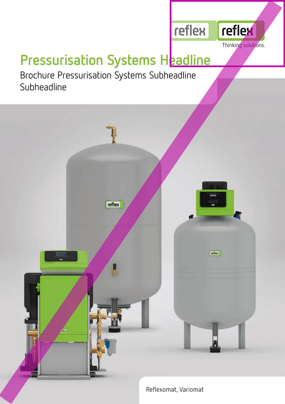
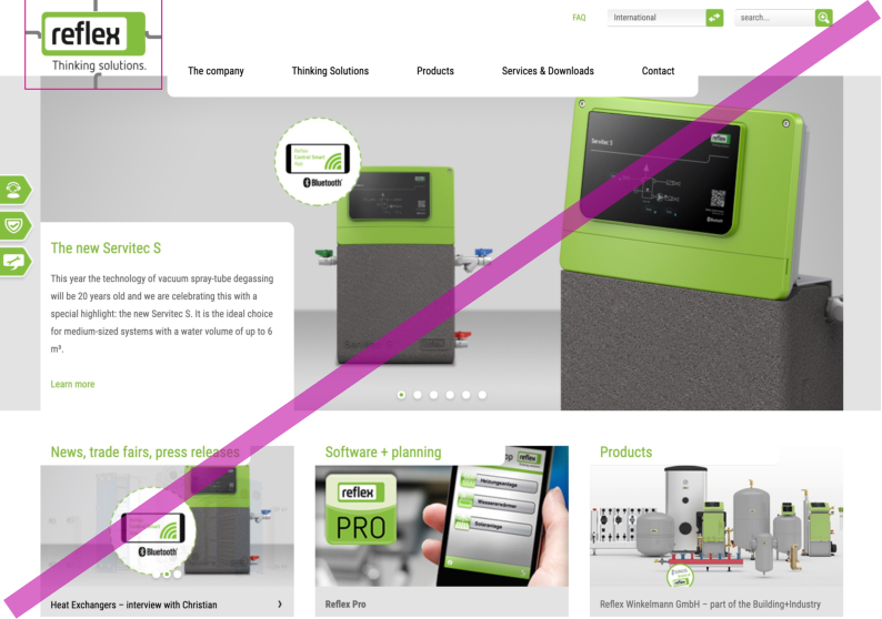
The shape of the Reflex logo references the silhouette of a classic diaphragm expansion vessel. We also use this stylistic idiom with layout boxes: they always have rounded corners as shown in purple in this figure for illustrative purposes.
Detailed information on the use of layout boxes is available in the Printed Material chapters.
The product brand SINUS
The products of our SINUS product brand are labelled separately. In this way, we create recognition of Sinusverteiler and strengthen the product brand.
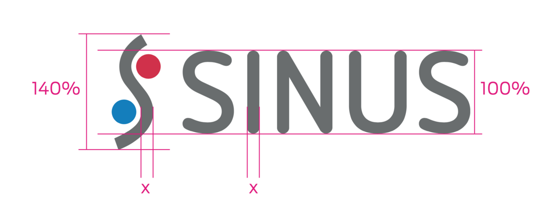
For this purpose, product nouns in headlines and subheadlines are always preceded by the SINUS logo and the brand name in capital letters in Netto Pro bold. The height of the logo corresponds to 140% of the capital height. The brand name and the product noun are written in SINUS grey (CMYK = 8|0|0|70; RGB = 105|109|110).
In the body text, the product nouns are preceded only by “SINUS” in capitals in the text colour, normally black. We define body text as text below 12 pt in print or 24 px/ 1.5 em on the web.
The same specifications apply for use on the web: in headlines add the picture mark, in body text only with the SINUS in front of the product noun.

