Infographics
Infographics are an important part of Reflex’s corporate identity. They help us communicate our comprehensive technological expertise. We use different sorts of infographics, for example, to explain complex relationships in heating and cooling technology, to collate technical data, or to illustrate how our product solutions work.
Diagrams
Diagrams are the preferred means of collating technical data. All diagrams are produced in green and grey. If necessary, you can add other defined colours (see Colours for Graphics).
Diagrams: layout
- Diagrams are drawn in a grey box with a 10% black background.
- The corner radius is 2 mm.
- Axes have a line thickness of 0.3 pt. Line colour: 70% black.
- Horizontal lines are 0.15pt thick.
- Vertical subdivisions are only used if they are required for legibility of the diagram. In this instance, use 5% black infill.
- Lines in line diagrams are 2pt thick.

Diagrams: grid
In product brochures or other publications, diagrams occupy either the entire or half the width of the type area. The height can vary with the baseline grid and is adjusted to suit the content. All Reflex diagrams are built on a 4mm grid.
| Formatting in the type area | Diagram width |
|---|---|
| 1/2 width | 86 mm |
| Entire width | 176 mm |


All of our circular diagrams are also based on the 4mm grid.
If possible, we place labelling directly on the diagram. To do this we use a mark-up.
- Imagine a circle centred on the diagram with a radius 2mm larger than the outer circle of the diagram. The mark-up runs horizontally from there to the labelling. The corner radius is 1mm, the line thickness 0.15pt.
- The labelling is left-justified on the left-hand page and right-justified on the right-hand page.
Cartographic illustration

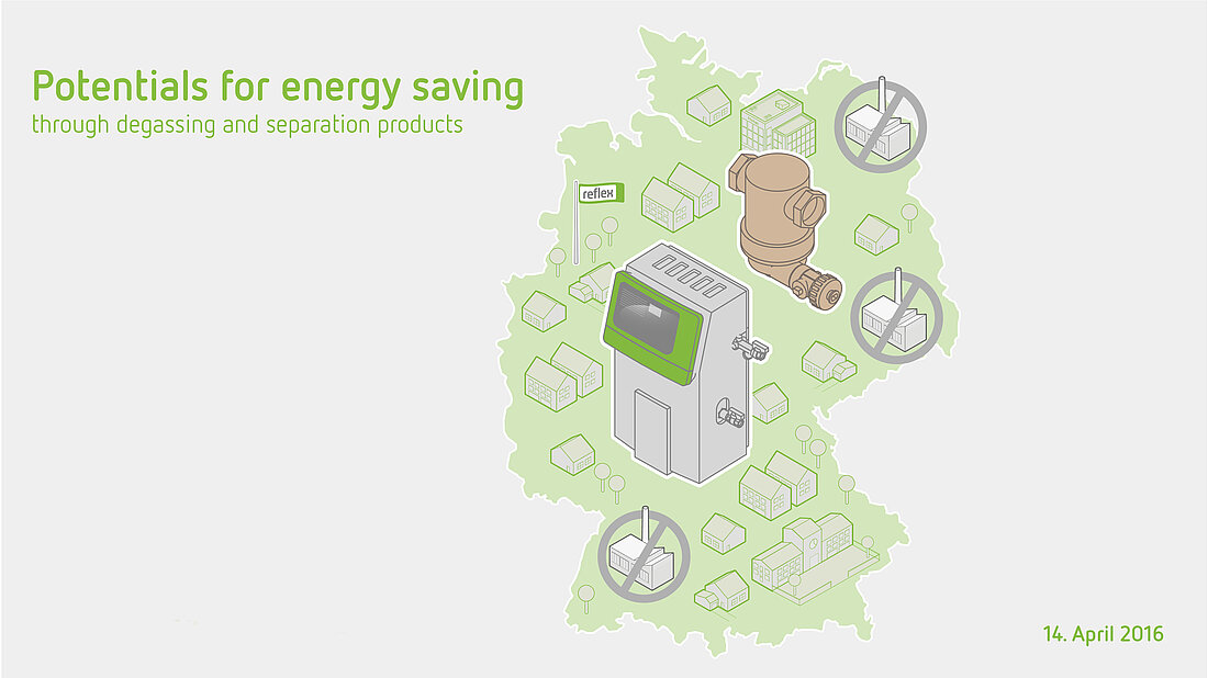
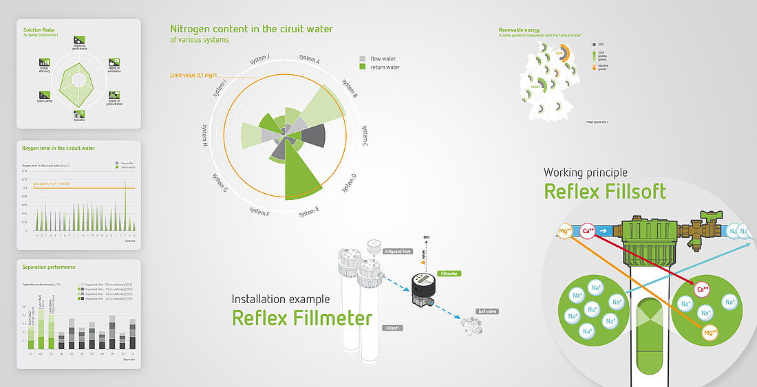
Complex infographics

Illustrating installation and product combinations
We rely on isometric representations to illustrate the installation of our product solutions or the combination of several solutions. Please ensure the correct colour scheme is used; the main product is shown and labelled in colour and all other items in white or gradations of grey.

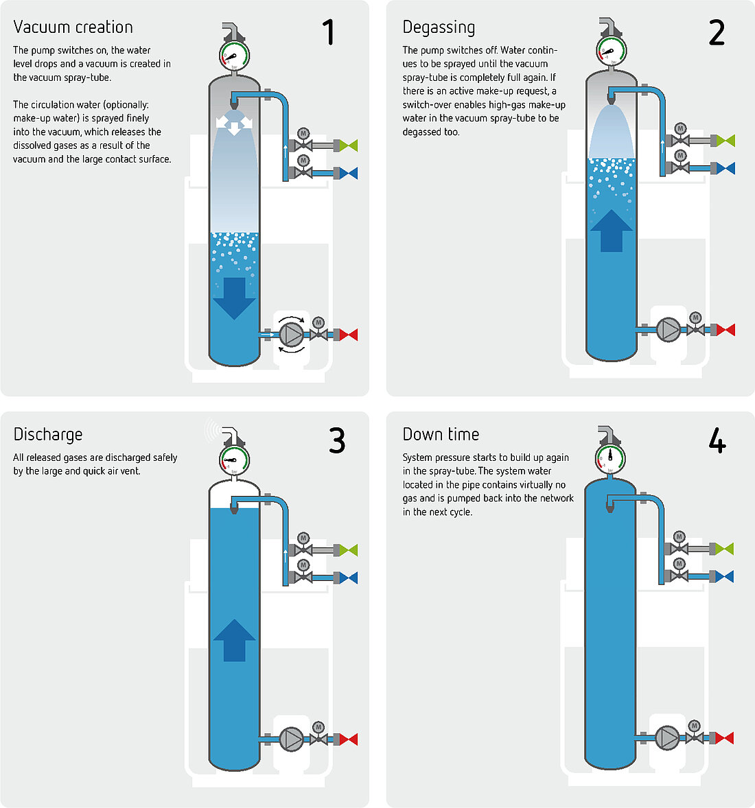
Schemes
Scheme design
When designing diagrams, please ensure they always adhere to the following specifications:
- diagrams are drawn in a grey box with a 10% black background.
- The corner radius is 2 mm.
Products are either: - shown in colour if the diagram is focusing on a product or
- in white and gradations of grey.
- Flow, return and make-up water are to be shown in the colours given below and orange is used to highlight specific elements.
- 85% black should always be used for outlines (pure black is not to be used).
- Use standard symbols for system components (pumps, valves).

Variations on diagrams
One diagram, different designs: Depending on the point of focus, a single diagram can be reworked in different variations, as shown in the three variations below. In the first diagram, the focus is on service and engagement (magnifying glass). In the second, it is on the connections. In these variations, the controls are therefore placed behind the diagrammatic symbols as a white area. The third variation of the diagram, on the other hand, is suitable for conveying basic technical knowledge independently of product communication, as far as this is possible.


Symbols for schemes
")


")
")


Colours for diagrams and infographics
You can find detailed information on the use of colours here:
Colours for diagrams and infographics