Corporate Font
Netto
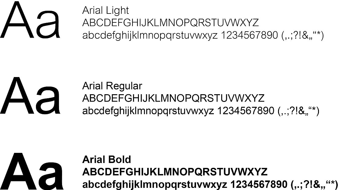
The Reflex font is Netto. We use the Regular and Bold weights.
Specific usage and examples can be found in the relevant sections in the chapters Print media and Digital media.
Since 2024, there is an update of the font—our own Reflex version.
It is available on request at:
marketing@reflex.de
This new version of Netto has small differences to the previous version (Netto Pro), but it can still be used.
Specific typography
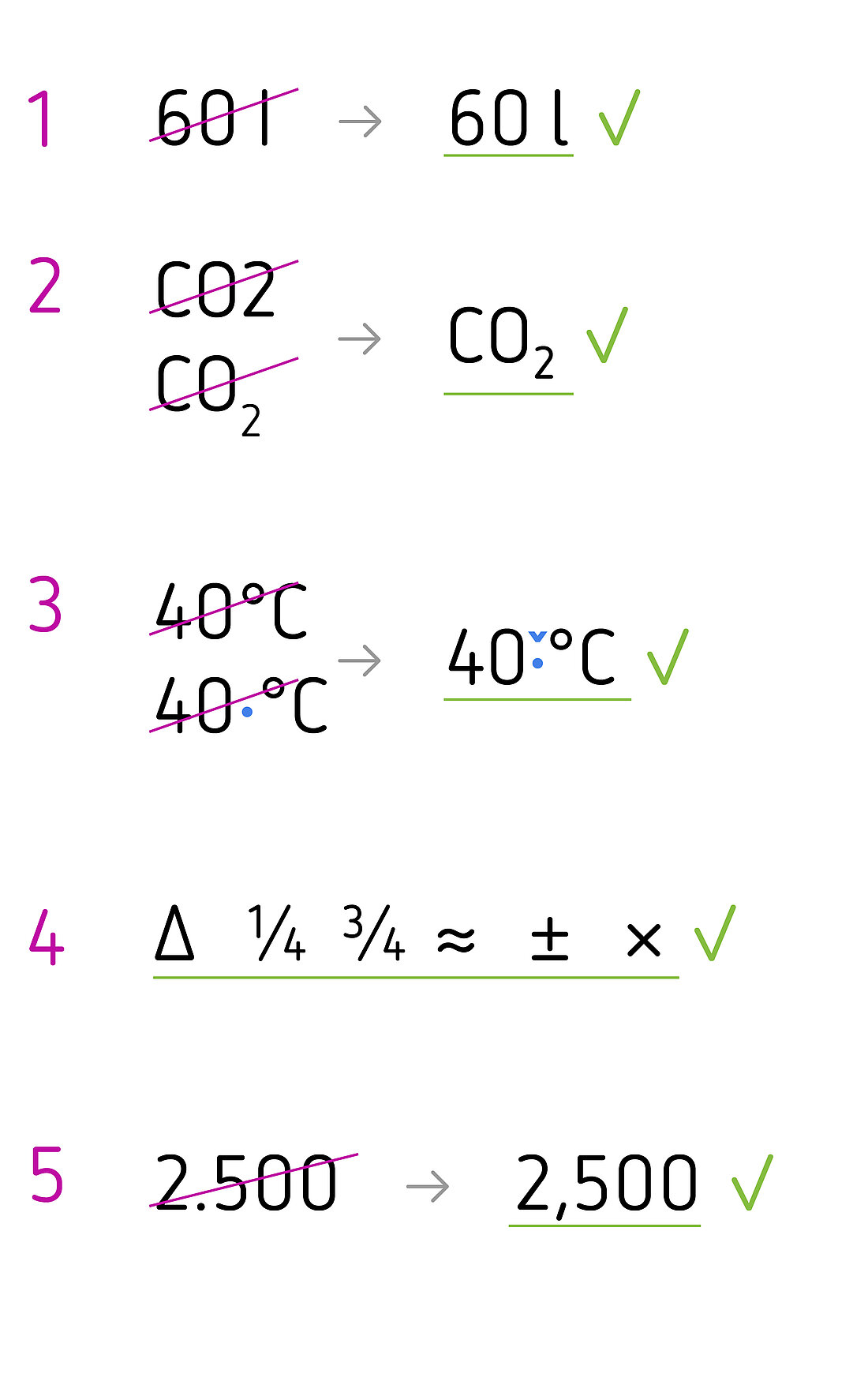
The purpose of our brochures and printed material is to present information clearly and accessibly. To achieve this, we also make use of typography. Therefore, please adhere to the following typographical principles:
- We use the stylistic set ‘Alternate l’ of Netto Reflex for lower case ‘l’ on its own, such as when specifying litres, due to its increased legibility.
- We use glyphs for subscript characters, as in CO₂ (in this instance: U+2082).
- We insert an eighth em as the spacer between digits and symbols for units such as % or °C.
- Netto Reflex has an extensive range of glyphs. Where possible, we therefore use mathematical symbols from this character set, for example, the Δ symbol (delta) and fractions.
- We observe country-specific formatting when setting foreign languages, for example, the thousands separator or when writing the date.
Substitute Fonts
Setting foreign languages
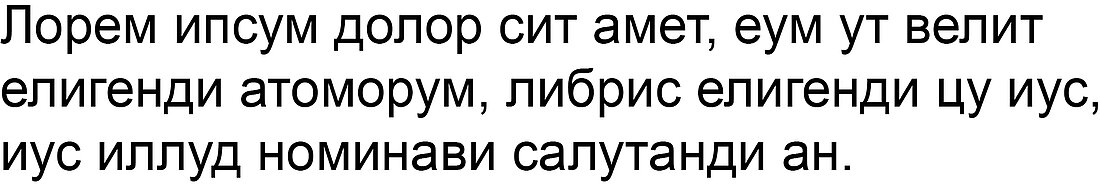
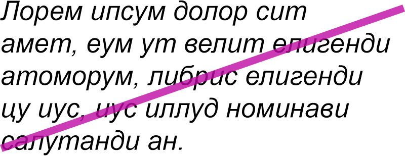
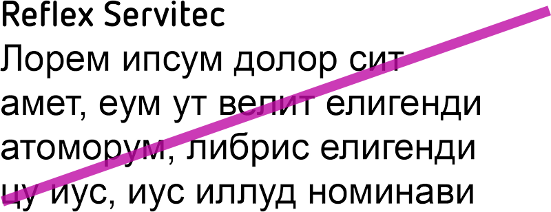
Netto can be used in many languages as it includes a comprehensive set of special characters. We need a substitute font in only two exceptional cases, i.e. Russian and Chinese.
We use Arial for Cyrillic characters and Noto Sans for Chinese.
All our other published languages are always set in Netto.