Illustrations
Illustrations have two purposes: to make text (more) understandable and to break up the layout and improve legibility. The information they contain is easy to understand. Illustrations do not, for example, explain technical functions (infographics do this). And they do not represent a specific topic (icons do that).
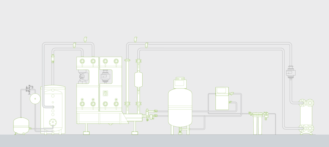
Product Line Drawings
The preferred method of illustrating our products is the so-called line drawing. Please note, these line drawings are not highly detailed illustrations (such as a rendering), but purely a design element. Line drawings may therefore only be used where specific details are not a critical part of the communication.
We use the variation of a white line drawing on a green background on packaging or pages to separate chapters.
The variation with a green drawing, white in-fills and grey background is particularly suitable for signage at trade fairs or events as the illustration is reduced to the essentials and can therefore be easily captured.