
Visuals
We produce cutting-edge technology. This can be clearly seen in our visual language: it is high-quality, non-frills and clearly shows what Reflex is all about. Thinking solutions, easy to install, energy-efficient, easy to use.
Which set of visuals is the right one? That depends on what is being communicated. We make a distinction between four image categories, each of which has a different function: so you will have the right image for every communication requirement.
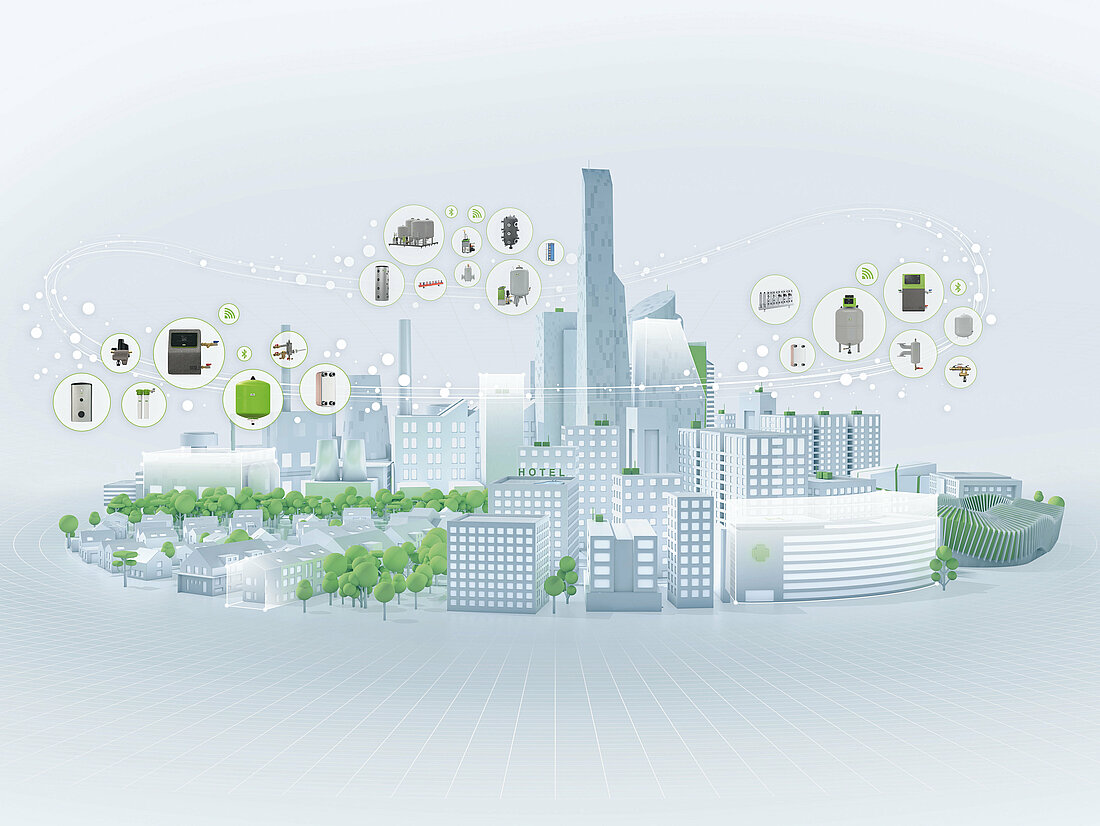

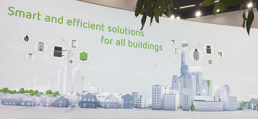
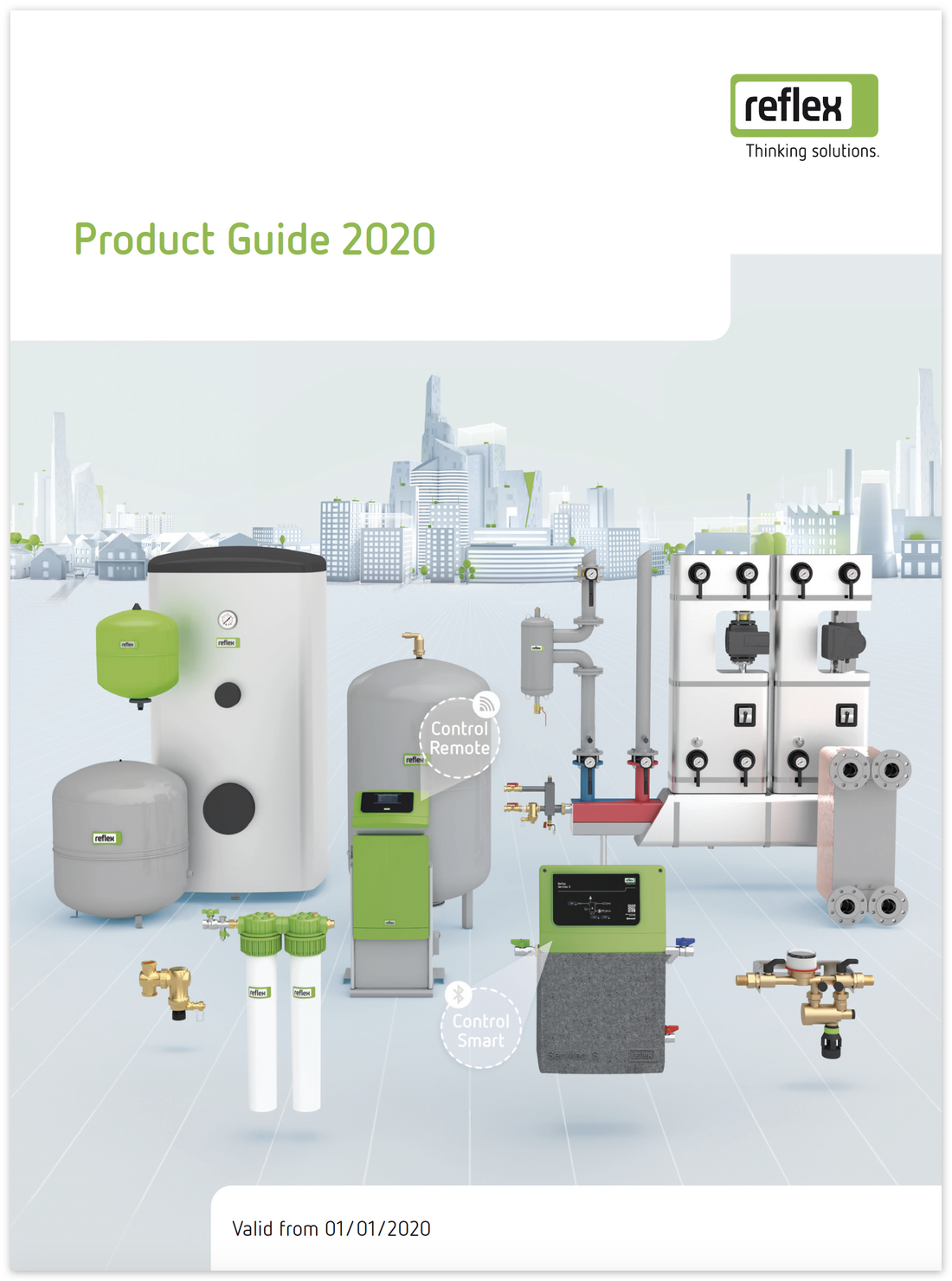
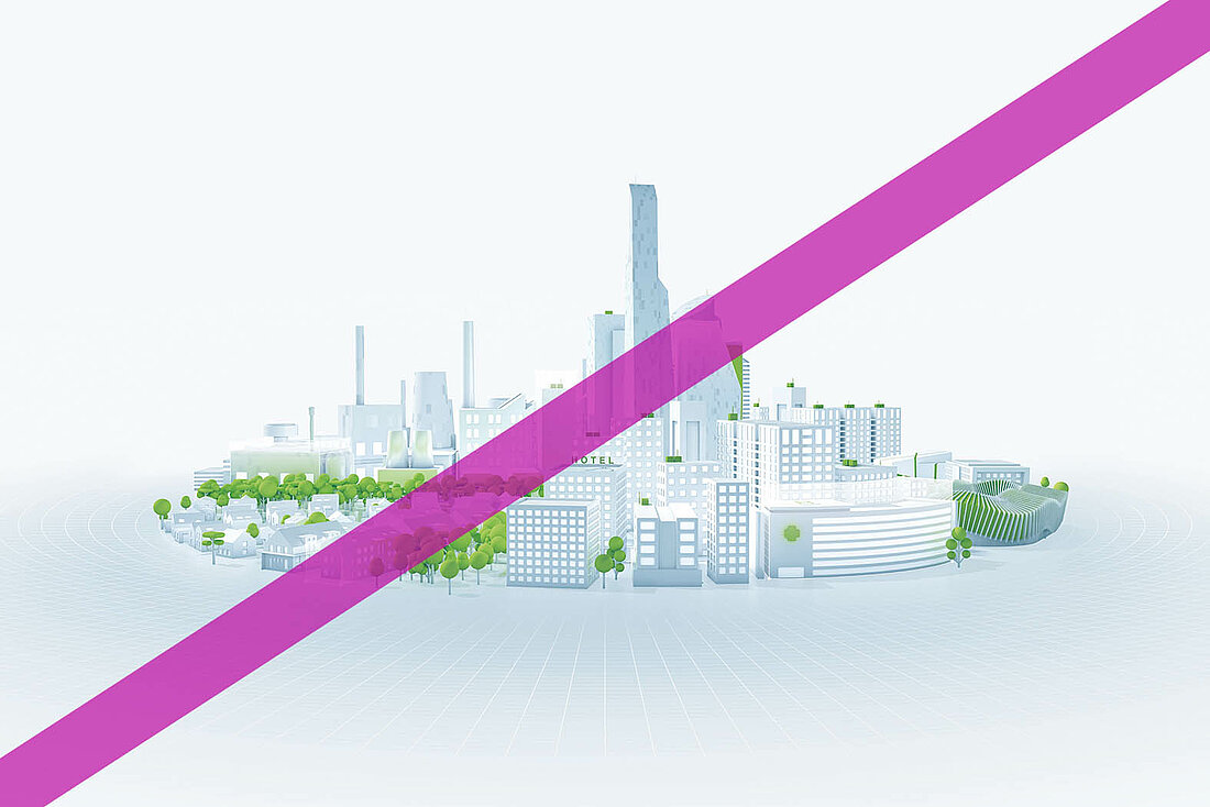
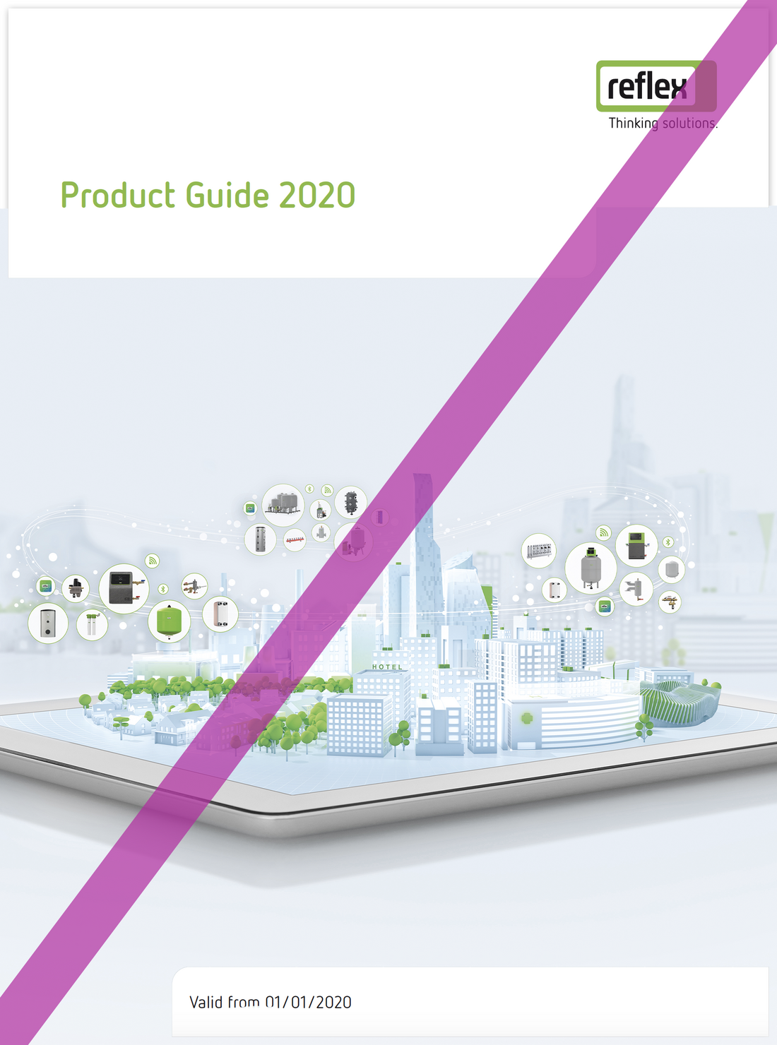
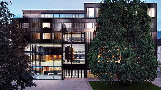
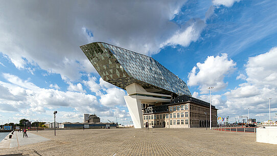
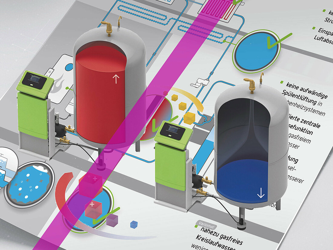
Overall Theme: Reflex City
Reflex City is part of the global climate change effort: it is Thinking Solutions in action. And this is why we use it as the overall theme for our product communications.
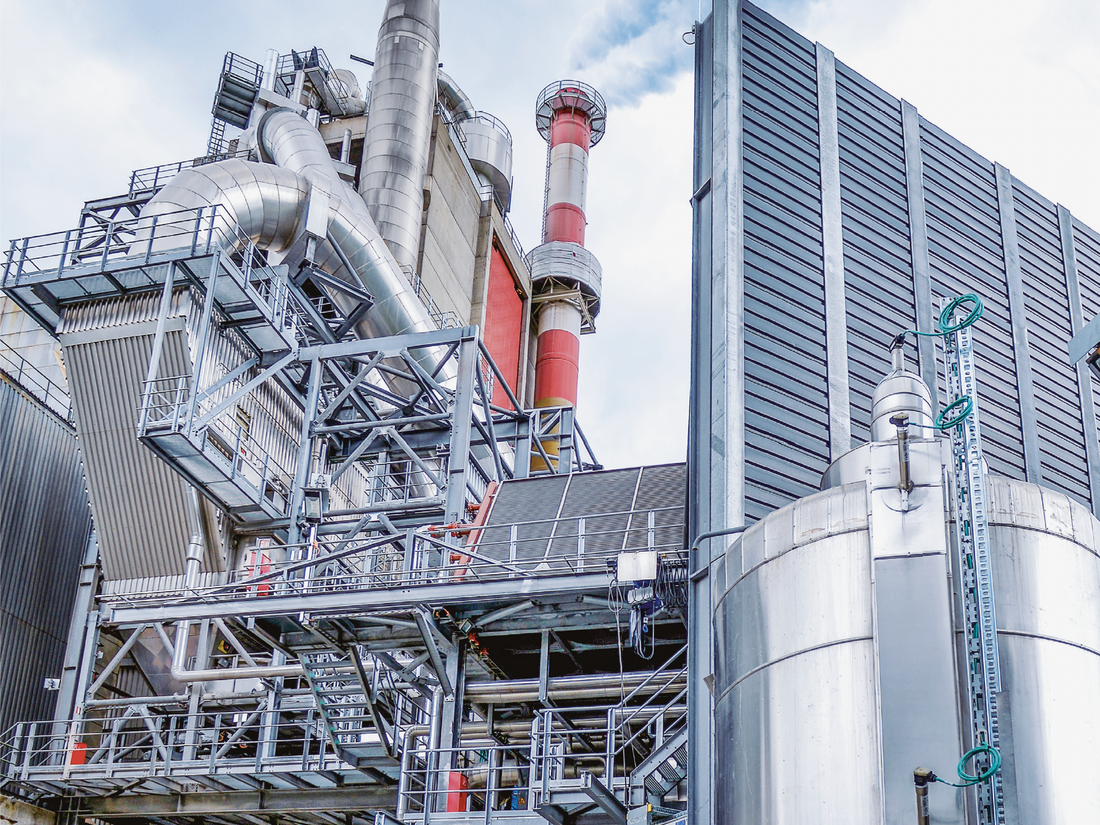
The city is a reflection of how we see ourselves. We can offer products and solutions for systems of all sizes and complexities. It is impossible to imagine Reflex City without our solutions and it must therefore never be presented without our products.

Applications which are product-dominated such as price lists can use Reflex City in the background. This allows us to create a link from our products to our overall theme and to present in images our message of technological leadership for every heating and cooling comfort requirement in a vast range of different buildings.

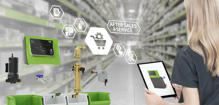
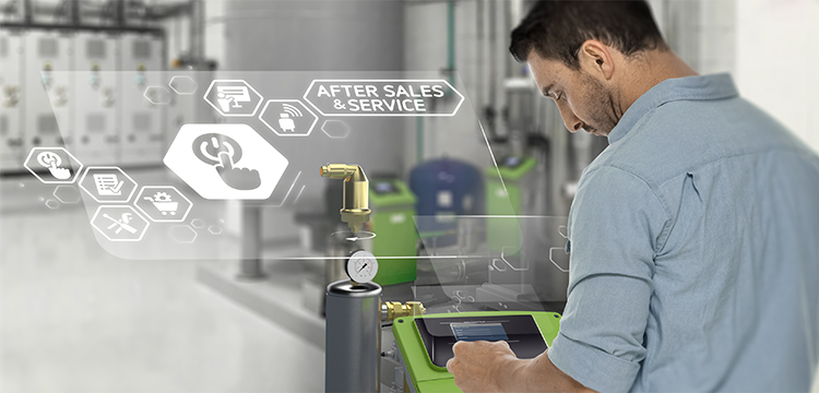
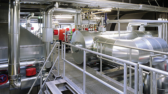
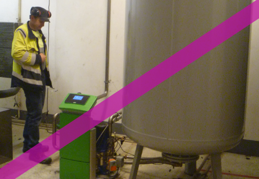
Themes for our Sales Channels

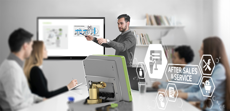
The individual visuals illustrate our after sales and service capabilities and thus represent our expertise in terms of both advice and product offer. All visuals are designed with a short depth of field, drawing the viewer’s gaze to the key element in the image.
Icons are added to service visuals to help differentiate between services.
This graphic representation in the image pins the service division shown to our other ASS services. We work locally and through networks and that is precisely what is represented by our key visuals.
Further information on the ASS icons is available in the Icons chapter.
Please note: Each motif is allocated to a service division and may not be used when presenting other divisions.


The Reflex Smart City App is a new self-explanatory and interactive way for users to discover Reflex City. It operates via the Reflex Augmented Reality Marker which we use to mark our products and brochures. The app is extremely sophisticated and cutting-edge. The key visual for the app is used in all communication initiatives that refer specifically to the app.


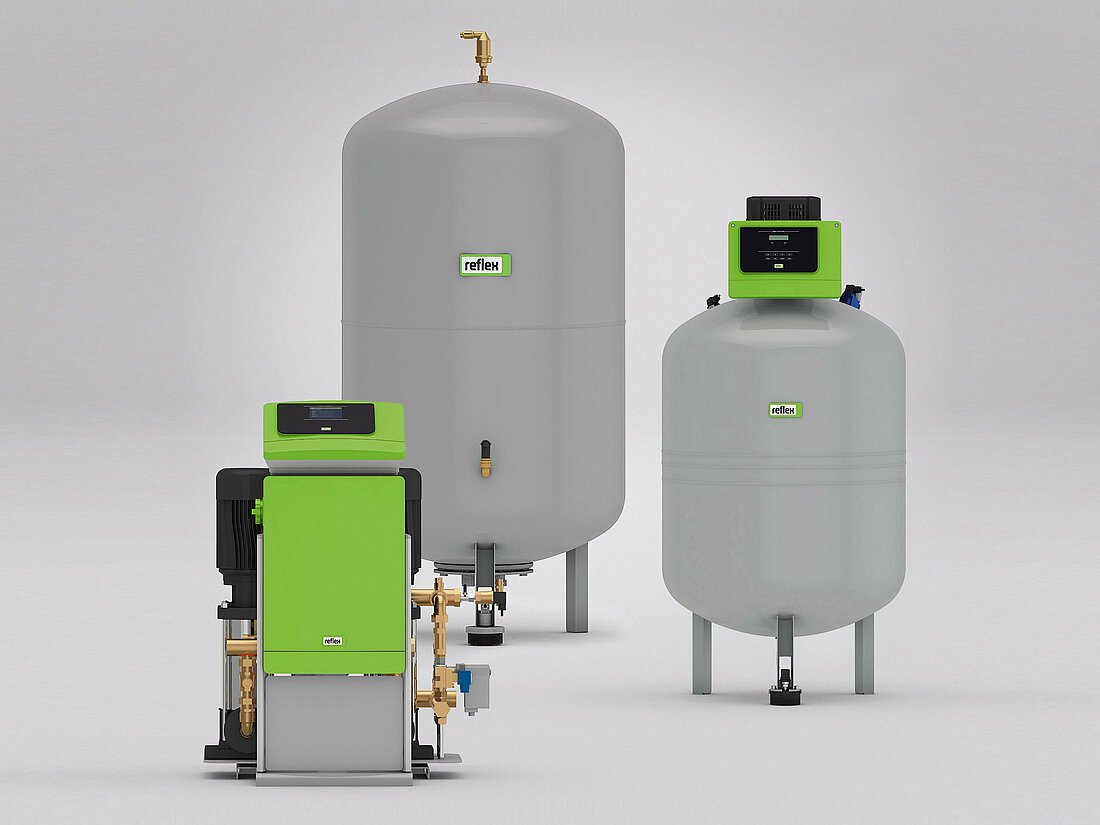
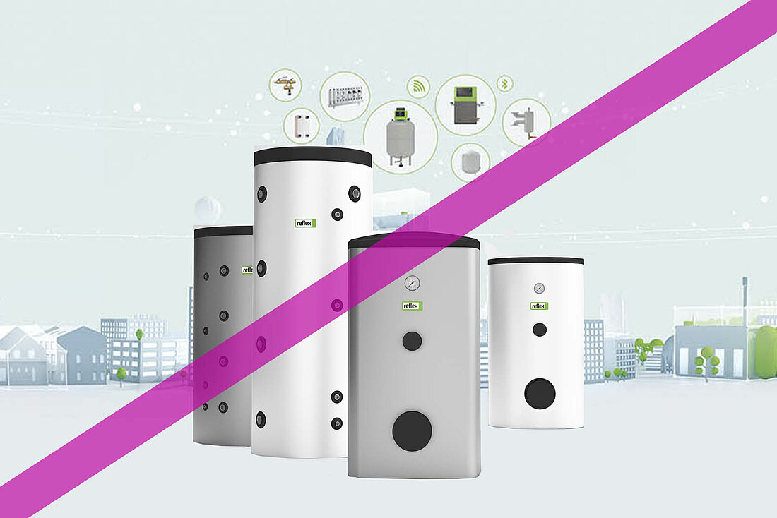
Portfolio Segments
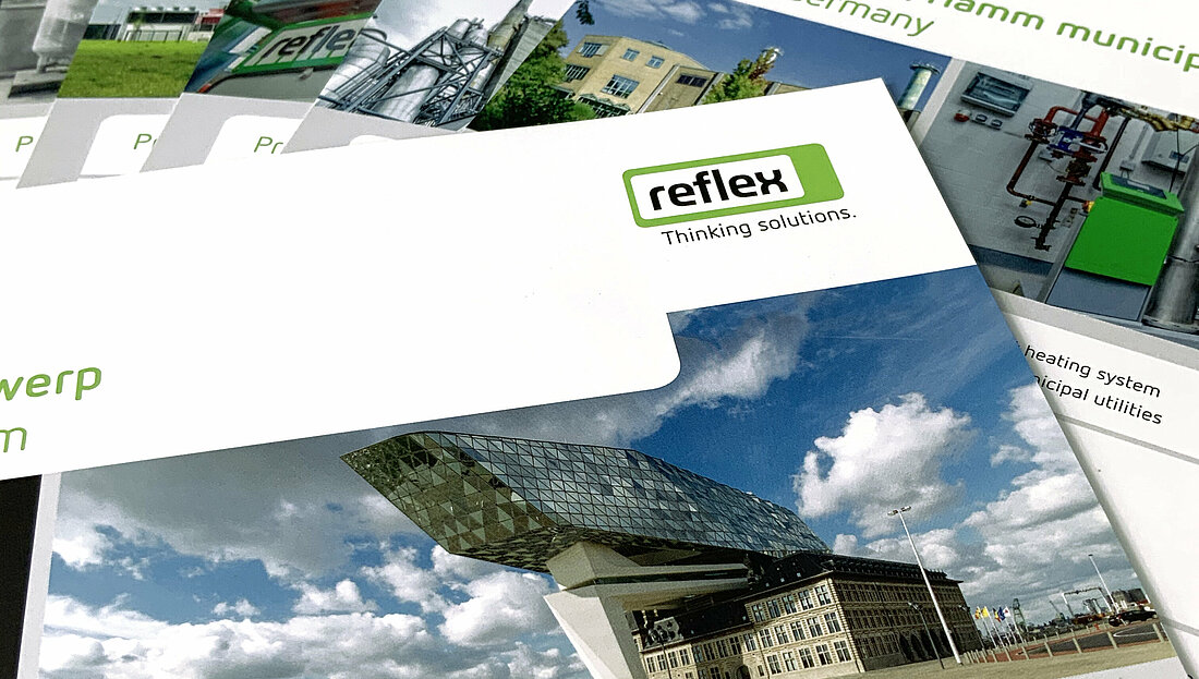
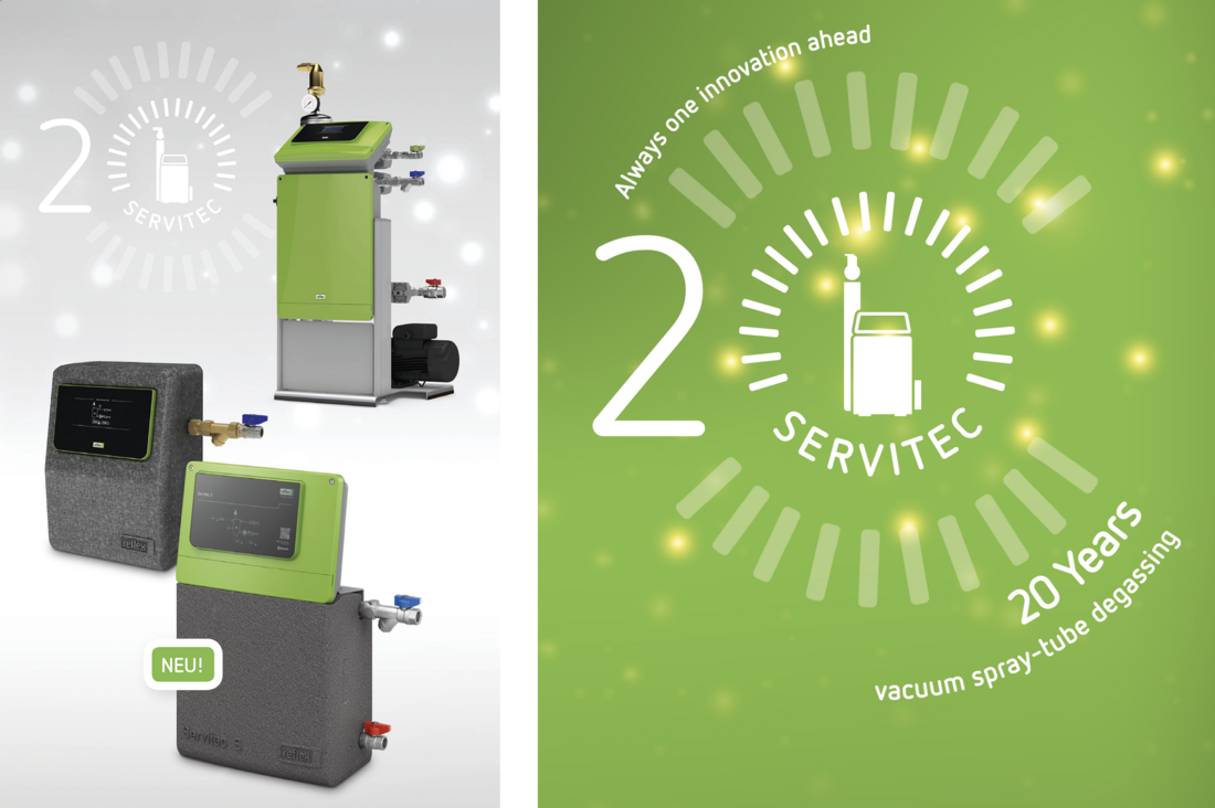
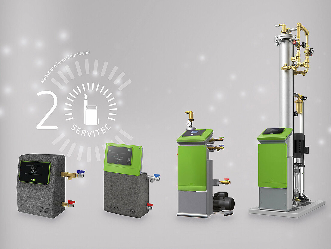
Our products are our ambassadors. The majority of our communication is therefore product communication – either as individual products or often as a product group. The motifs illustrate the portfolio segment with typical products and are presented in B2B communication as brochure covers, in advertisements, on roll up banners, at trade fairs and on the web.
Image Content
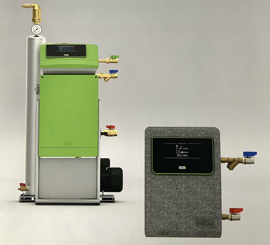
The motifs typically show a few products which represent an entire product segment. You choose depending on the theme of your communication initiative: only one product or a combination of products.
Colour Scheme and Contrast
All motifs are presented on a neutral, grey background. The colours are saturated so watch out for extremes of colour contrast For products with grey components, we only use Reflex green (see chapter Colours).


Tone
The images have a matter-of-fact, neutral tone.
Perspective
Product-related motifs are shown face on.
Foreground and Background
If required, you can place a product in the foreground for a more dynamic composition. Make sure all images are sharp. Keep a neutral grey for the background; if necessary, a suggestion of a horizon can be added.
Lighting Conditions
The products must be evenly lit. Make absolutely sure there are no dark shadows or overexposed areas. All shadows should be subtle and unobtrusive.
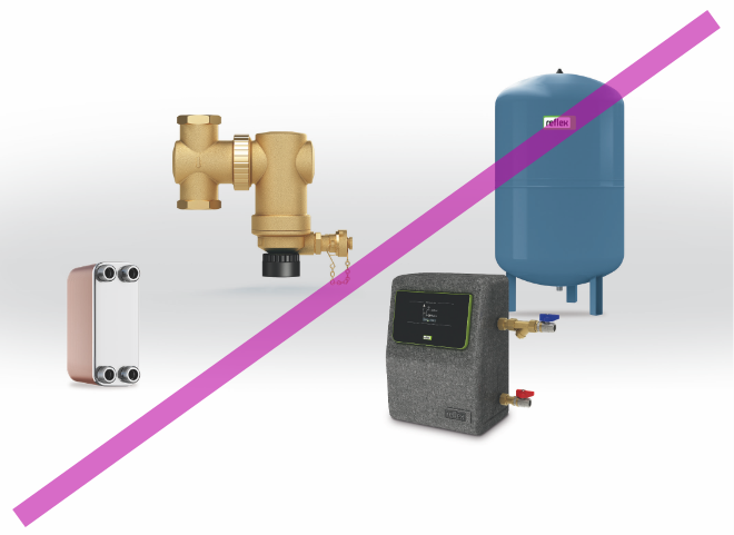

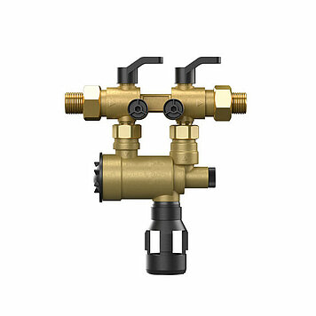
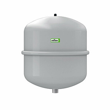
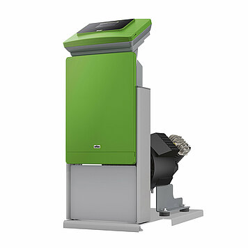
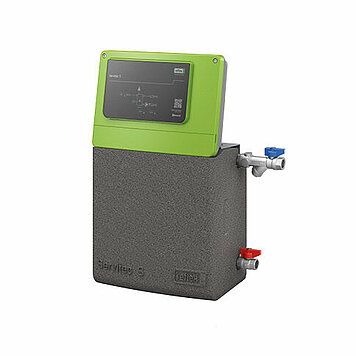
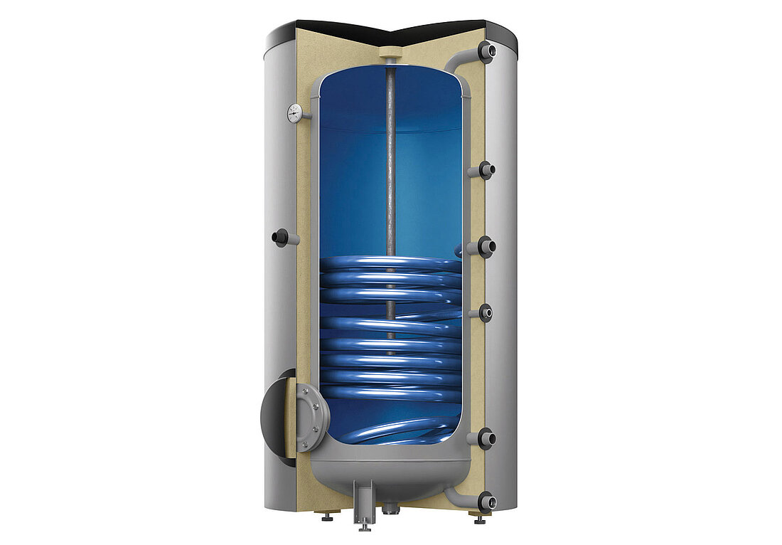
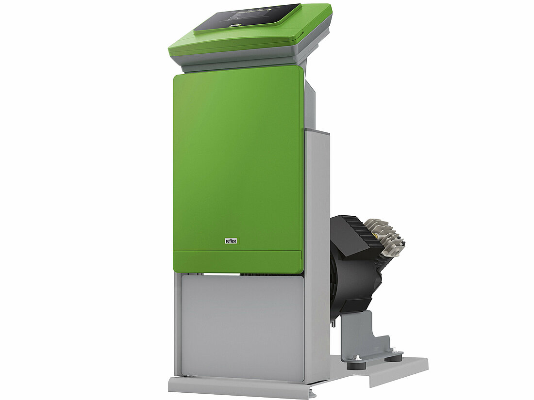
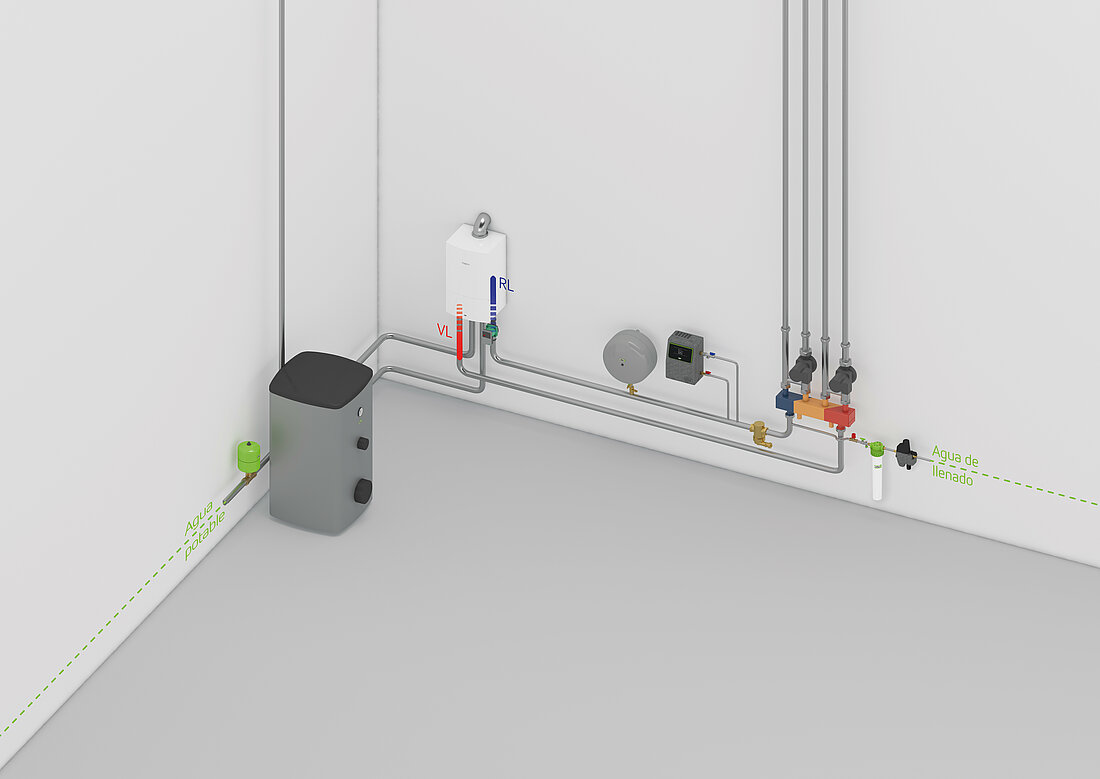
Individual Products for Technical Texts
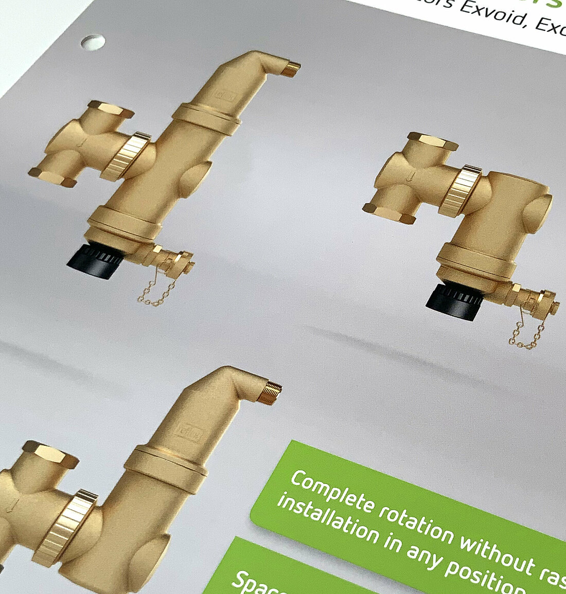
The product images shown here are only used for technical texts / explanations / USPs in, for example, price lists and data sheets.
These product images have special features, specific to the product group. If not enough product detail is visible from a front-on view, these are shown from an angle (Servitec, Variomat, Reflexomat, Longtherm). All of our water storage tanks are shown in sections.
Image Content
The motifs illustrate a specific product – they are generally shown face on and undistorted. Please ensure the Reflex logo is visible on the product.
Colour Scheme and Contrast
A realistic colour scheme is important for us:
our products are shown as cut-outs on a white background.