Primary Colour

Colour Range
The Reflex colour palette is dominated by two colours: our primary colour Reflex green and the complementary grey.
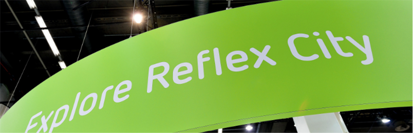
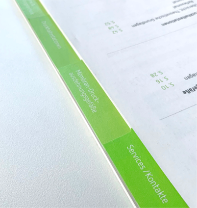
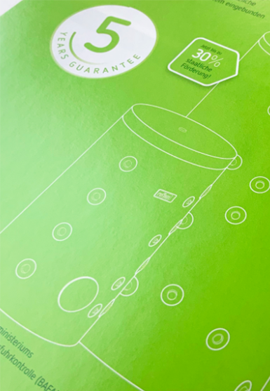
We always give 100 per cent! And that is how we treat our Reflex green: we usually use it undiluted (100%) and only use a gradation if necessary for design reasons, for example, for tabs, diagrams or as a background colour in text fields. Our logo is always shown in 100% Reflex green.
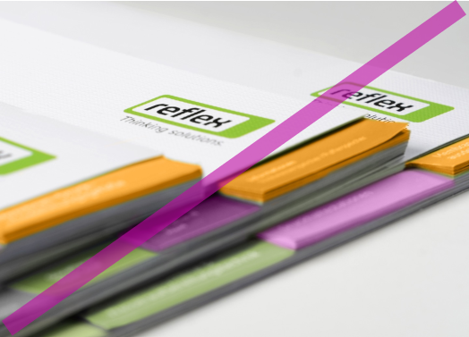
Our Reflex green is complemented by gradations of grey. If there is no way of avoiding it, we occasionally and sparingly add other colours to our colour range.

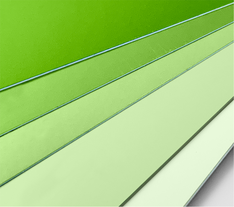
The following shades of green are extensions of the colour spectrum or gradations of Reflex Green.
They have defined functions in the UI design (UI/UX manual) and can also be used sparingly in print media or social media.


Colours for diagrams and infographics


Colour Management
Reflex green is a clear flag to show who we are: pioneers in the development of sustainable technology to increase efficiency for heating and cooling systems. That is our identity and this identity is Reflex green.
Reflex green is at the core of our corporate design. We therefore make sure that it is clearly and unmistakeably visible. To achieve this, we have the following options:
Ideally: print as a special colour
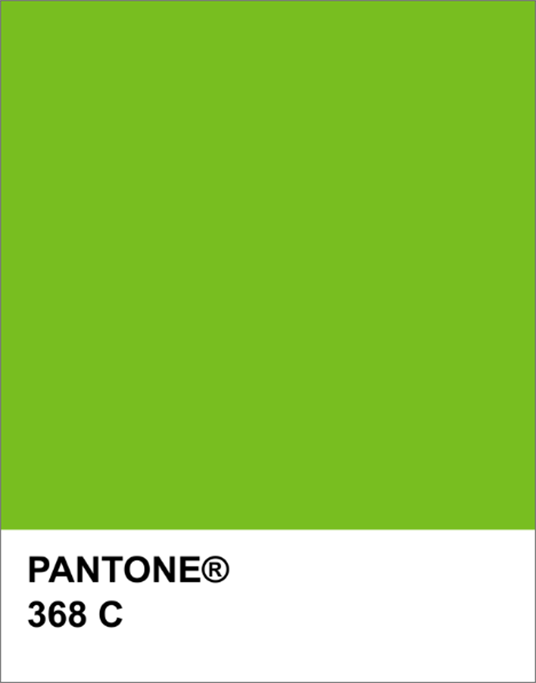
The most precise colour accuracy is achieved if we have Reflex green printed as a special colour in Pantone 368 C: this is a standard colour.
Alternatively: four-colour printing with press proof
We can achieve a consistent reproduction of Reflex green using four-colour printing (CMYK: four individual colours printed together). The press proof for this contains all the colours in every gradation and is produced together with a printing house. The printing house is provided with the press proof for the specific printing job so that the colours can be adjusted accordingly on the printing press. Please note: Press proof sheets must be stored protected from light.
Compulsory: print approval
In order to guarantee the quality of the colour, we always complete a print approval process. We inspect the printed matter using the press proof sheet (for four-colour printing) or the colour fan (for printing special Pantone colours).
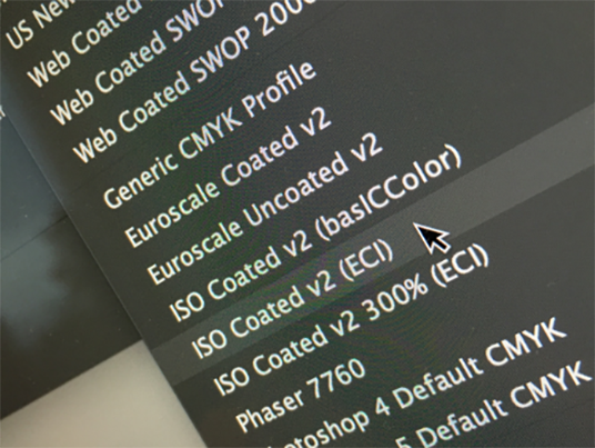
ICC colour profiles
The so-called ICC profiles (International Color Consortium) contain all the requisite information on printing. We also work with an ICC colour profile as well as the ISO Coated c2 (ECI) standard when producing all our documents, whether using a special colour process or CMYK.. Why use a standard? ISO Coated v2 (ECI) is the profile most commonly used by European printing houses as a profile for printed material. In order to achieve reliable print results, all the data are produced in this profile and all programmes are synchronised to this profile. This ensures the so-called soft proof (as shown on a screen) is correct. If offset printing is used, we use the ISO Coated v2 (ECI) 300% profile as the maximum ink is limited to 300%: this ensures that not too much ink is applied to the sheet and short drying times are achieved.
See chapter Paper for recommended paper types.