Websites
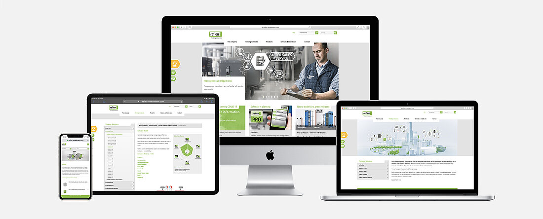
Our digital media design, particularly our internet presence www.reflex-winkelmann.com, is governed by our web design principles which are derived from the basic Reflex Corporate Design principles. Our web design applies globally and is binding, without exception, wherever digital Reflex media are designed or promulgated.

Web design
Our web design applies to every page of our net presence. Please ensure you adhere to the following specifications at all times:
1. Colours
The colour palette for our website follows the colours specifically defined in the section Design Basics. As legibility on the web depends on colour, we primarily use white and grey. Our Reflex green is used for headlines and elements which prompt interaction from the user (e.g. Find out more).
2. Header
Headers are particularly important on our website as they highlight the essentials at a glance: new products, services or forthcoming events. Please note that the design of the header deliberately separates images from text (no overlap). The relevant image content is right-justified as the reader’s gaze is drawn to this first.
A template is provided at the end of this section for designing headers.


3. Language
Our brand value speaks for itself. Clear, informative and focused on our specialist audience.
4. Icons
Digital media are fast-moving media. This is why we prefer to use icons when designing them. Our Reflex icons are easy to identify and create specific themes or specialist content at a glance. Please assign the icons to the appropriate content as accurately as possible. Find out more about our icons in the Icons section.
5. Iconography
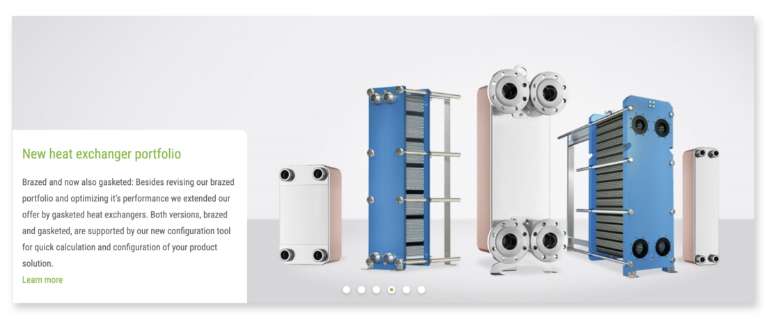
Our website lives and breathes strong images. Please select your images carefully and to suit the requirement. This manual includes a whole section on our Reflex visuals: Visuals.
6. Logo
As in all our digital media, our Reflex logo is also placed left-justified on our website. Please note the white space around the logo, specifically the logo height and width (see section The logo for more information). If there is insufficient space for this, in exceptional cases, you can reduce the white space around the Reflex logo using the ‘r’ of the reflex to define the white space.
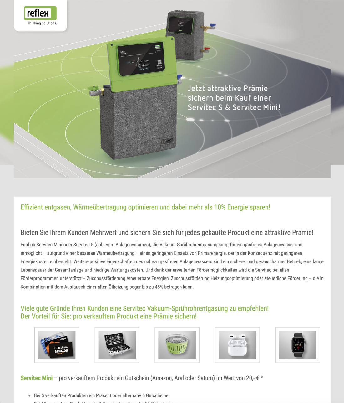
Micro-sites
As the name implies, a micro-site is a small website which is usually just one page. It has its own URL.
We use micro-sites if we want to dedicate a unique site which is independent of www.reflex-winkelmann.com to a specific topic. These are usually time-limited marketing topics such as trade fair promotions or incentives but can also be product-oriented promotions such as Servitec Mini or A storage tanks.