

General information
The Reflex Solution Pro (RSP) design tool is a hybrid web app. It helps our customers to find and design the appropriate products for their project (Reflex and Sinus) as well as product information (Reflex Solutions).
Orientation at a glance. The app's significant depth of content is laid our clearly and practically. Design has a very important role to play here and this is why RSP has been granted special status in its use of the Reflex corporate design.
Colours
Colours have an important role to play in ensuring our customers can orientate themselves clearly and quickly in the RSP app. Specific functions or content are therefore always highlighted in the colours given below – please pay particular attention and always use this colour coding.
The dominant colour is Reflex green. It guides users through the app, step by step, by showing them the next possible interaction.
Red is a warning colour. It indicates that users, for example, should check entered data again or review an anomaly.
Orange is an advisory colour. Elements in orange provide additional information or offer help which may be relevant for the design process.
General comments on the subject of colours are available here: Colours.


Typography
All general comments on which fonts we use where can be found in the Typography section of this manual. The design software for RSP is:
1. Web font Netto Pro
For headings
2. Web font Arial
As Arial is also easy to read in very low resolution, we use it in the app for all formulae and all content that is not a heading. This helps to ensure the app is easy to use.

Reflex animated icons
The icon set shown here was developed specifically for Reflex Solutions Pro.
The icons clearly illustrate the app's functions; they are almost impossible to misinterpret. By using icons we have developed ourselves, we ensure high usability and a positive user experience.
Please note: Product line icons are also used in RSP.


UX & UI design
The interface design of Reflex Solutions Pro is neat and clear and helps users produce individual solutions (individual products and product combinations) with complete documentation.
The individual programme functions in RSP each have their own, unique view. The app therefore has four clearly distinct views: home page functionality, design, configuring solutions and, finally, project management. This clarity of design is yet another reason why the app is so extremely user-friendly.
(Further information on the design of the home screen and the app icon is available in the Apps section.)
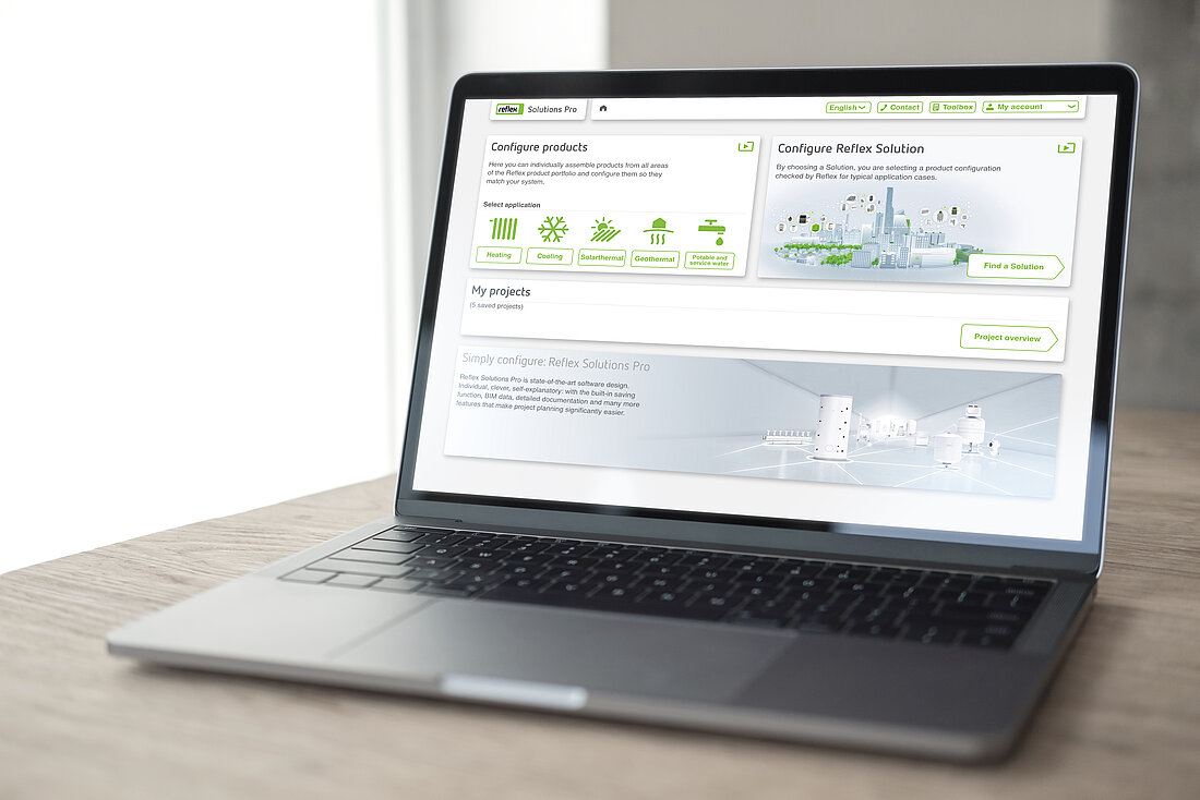
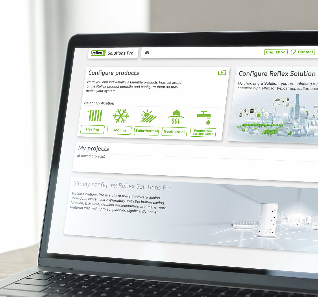
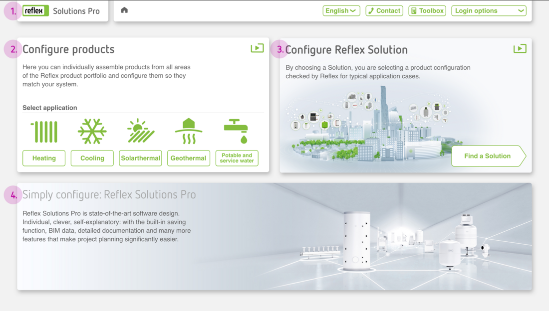
Home page
The home page shows the principle functions of the app at a glance.
1. Header
The header contains quick access to the choice of languages, contact, toolbox and login options. It is available at the top of the screen at all times while the app is in use. Further information on the design of the header is available in the sub-section Components in this section.
2. Design Reflex products
This area on the home page provides access to the design area for Reflex and Sinus products depending on the user’s area of application. The individual application options are illustrated with the Application area icons.
3. Design Reflex Solutions
This area on the home page provides access to the design area for Reflex Solutions. One click on this area and the user can start designing!
4. Marketing banner
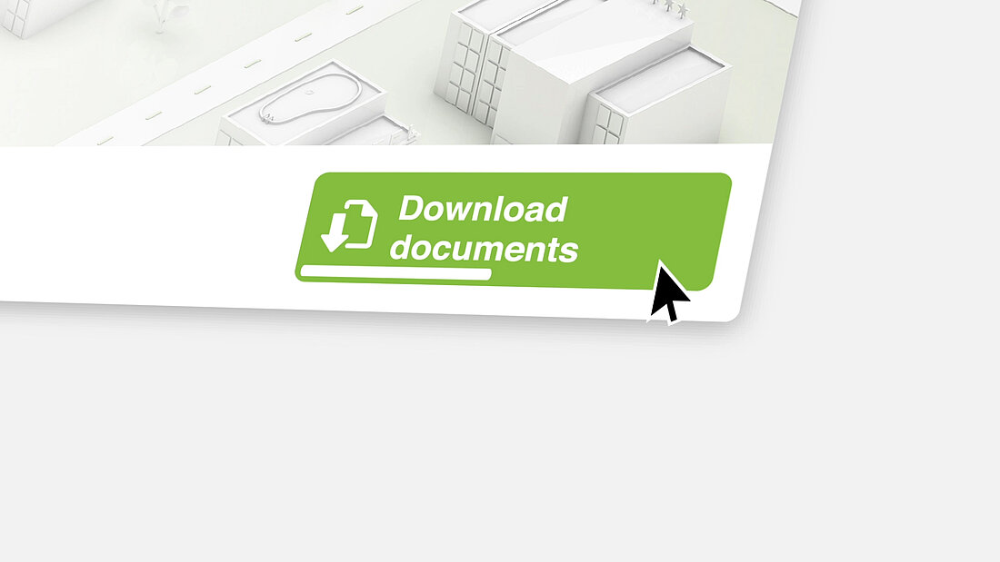
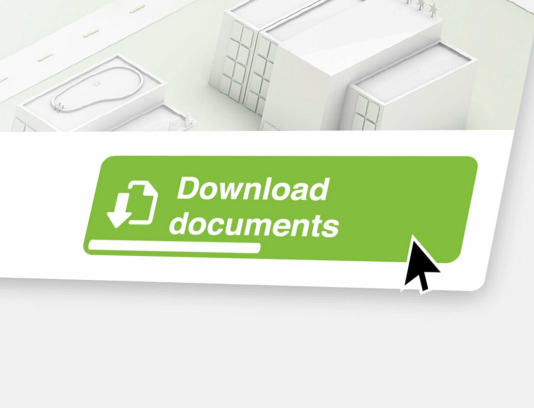
This block displays various topics similar to the header on our website. We present new products, services and forthcoming events here. When designing graphics, please ensure that the important image content is set right-justified so that the text field does not overlap them.
Design
1. Options
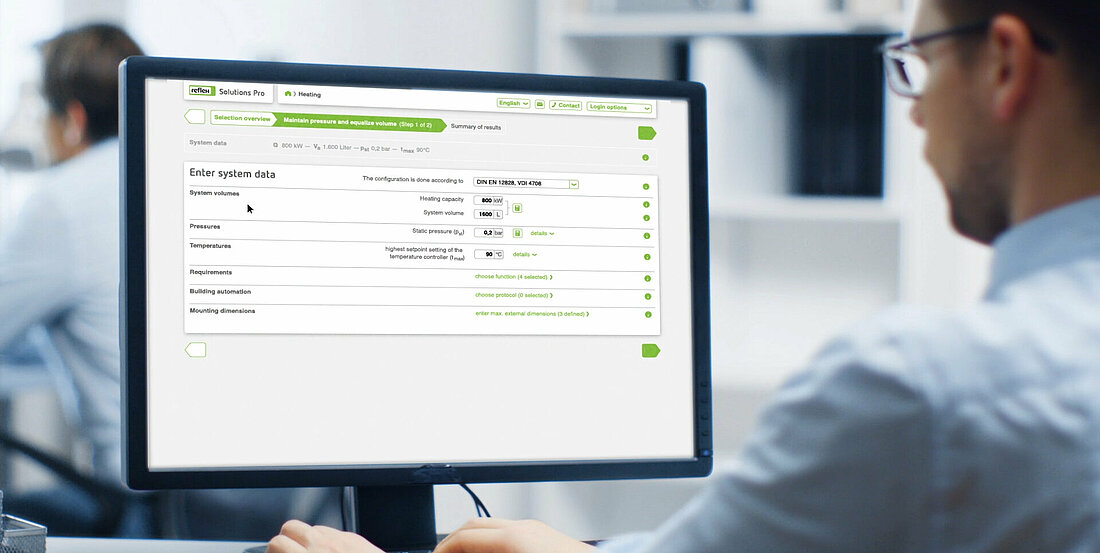
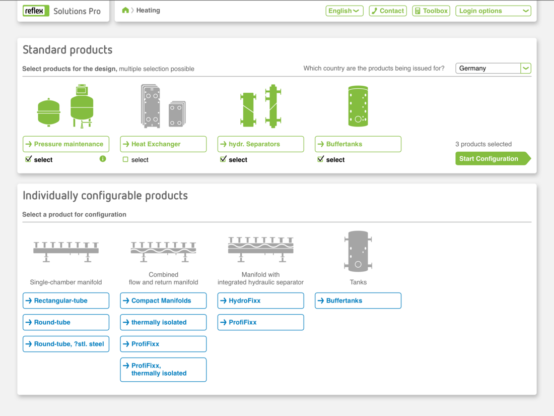
On this page, the user selects either one (or more) standard products or an individually configurable product. Information on illustrations for products or product lines are available in Illustrations. The screen comprises two striking colours: Reflex green and Sinus blue for Sinus products.
Reflex Solutions
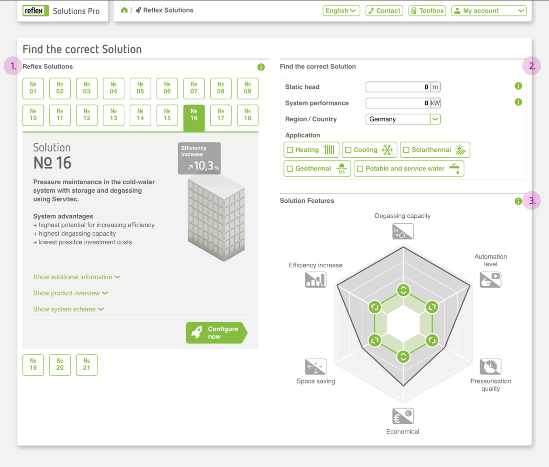
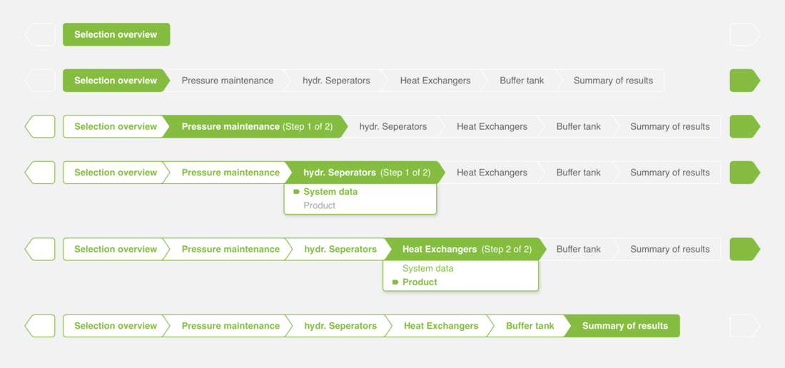
1. Options menu for Reflex Solutions
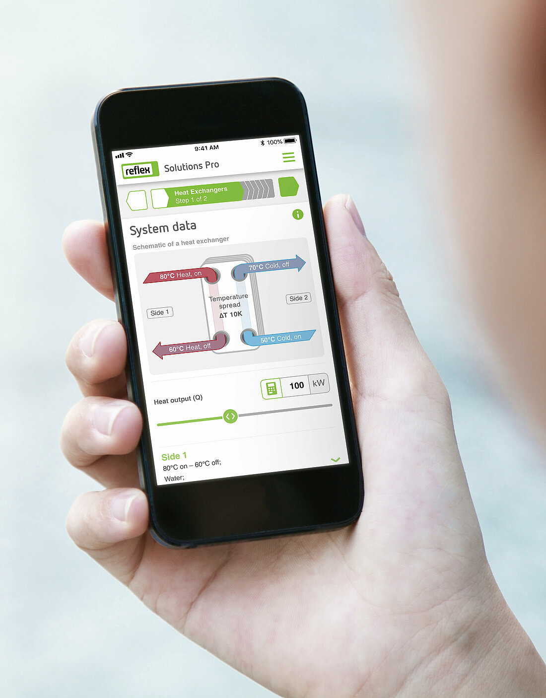
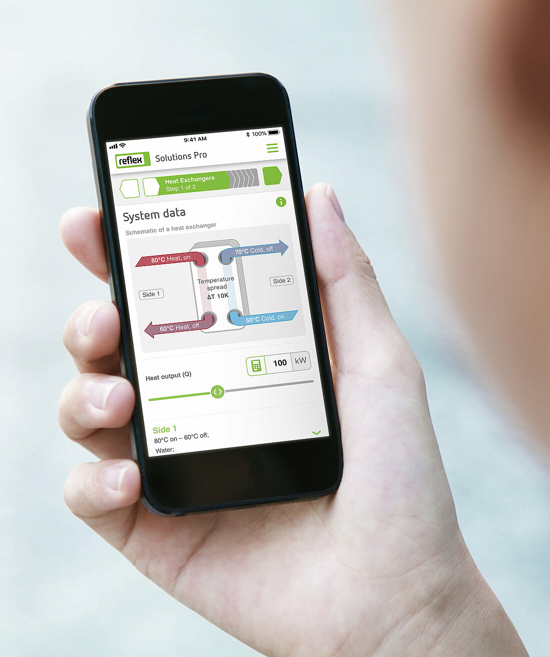
On this page, the user selects his or her Reflex Solution using the appropriate tile. The tile unfolds and shows the essential elements of the solution. An icon indicates the next step ‘Design solution now’.
2. Entering basic technical data for system planning
This area contains filter options. And the user can enter the static height, system output and usage.
3. Choice of parameters using the solution radar
What are the most important parameters for this specific project? The user can filter in this area by favourite functions.
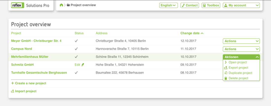
Project management
The Project Management screen shows registered users all their projects at a glance (completed designs or in progress). The project list can be sorted as required by title, status, address or date last modified. Each project has an actions button: the user can duplicate, export, edit or delete it. He or she can also import other projects here or start a new project design.
Components
Header
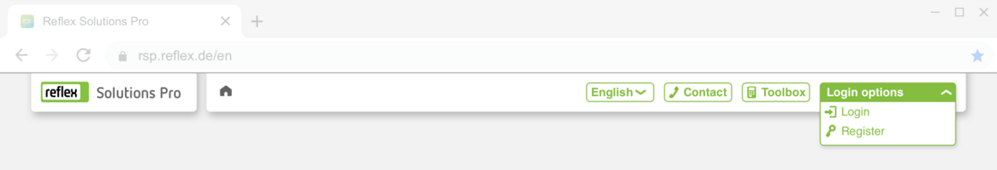
Headers are always composed as follows: the logo on the left, then, from left to right, the navigation lines (bread crumbs), language settings,quick access contact and the toolbox. On the far right are the login options which vary as follows:
Structure when not logged in
Dropdown options for Sign in or Register. Please make absolutely certain that these terms are clearly differentiated from each other in the relevant language (see example below in English).
Structure when logged in
Logged in users can view and edit their specific user data on the right under My account.

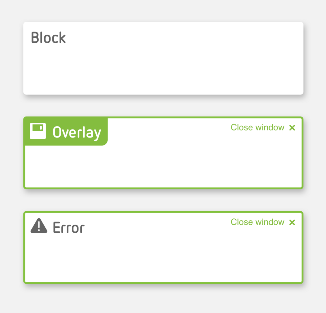
Blocks
Reflex Solutions Pro is made up of various different blocks. These blocks each have a specific meaning in terms of content. They also cluster information and data visually. The height of a block is governed by the amount of information it contains.
1. General blocks
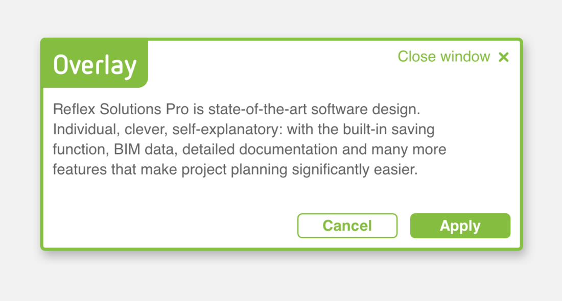
2. Overlays
3. Fault messages
Please note the special Marketing Banner block mentioned above in the section Home page.
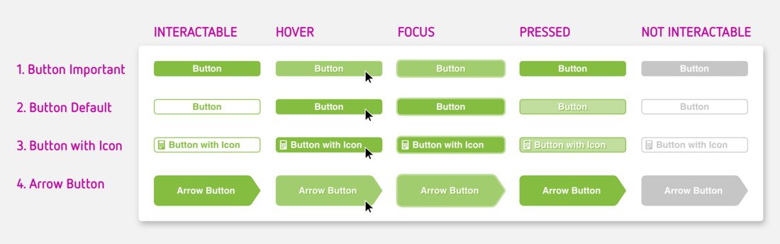
1. Solid button
This button has particular emphasis as it is a solid green. It grabs the user's attention. These highlighted areas should therefore be used sparingly.
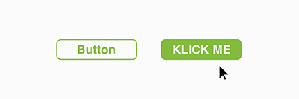
2. Button with border
Standard buttons have a border. They indicate actions available to the user on this screen. The preferred action however is indicated with a solid button.
3. Button with icon
In addition to the solid buttons and buttons with border (1 and 2), an icon can also be added to a button. The icon is an additional indicator for the action that will executed by clicking the button. The icon's colour is determined by the text colour in the button.
4. Arrow-shaped button
Arrow-shaped buttons are used where clicking on the button will execute an important action and will take the user to a new screen: next! Arrow-shaped buttons can also be combined with an icon (icon colour is determined by the text colour), Please note, arrow-shaped buttons also come in two variants, solid and with border.
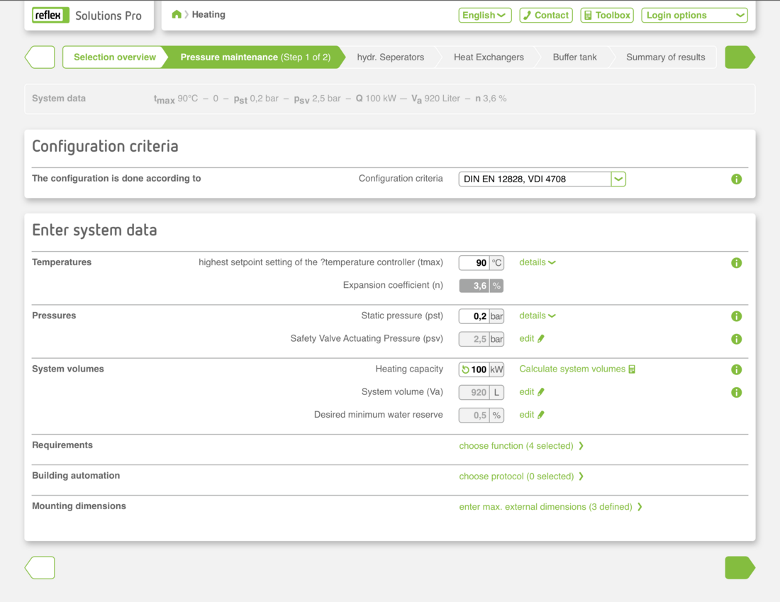
5. Input field
Input fields are provided for all numerical and text entries made by the user in the program. If there is a unit for the value, it is shown on the right.
6. Combo box
Combo boxes provide the user with a choice of entries which cannot be edited, for example, because they have to comply with specific standards or standard values.
7. Dropdown menu
Dropdown menus allow the user to go directly to the required link.
8. Toggle Button / Switch
Toggle buttons are simplified check boxes where the user chooses between option A or B. These switch buttons are always binary.
9. Check box
Everything OK? Check boxes appear either individually or as a list. When in list form, the user can tick none, one or some check boxes.
10. Radio button
So-called radio buttons are used where two or more options are available for selection in a list which are mutually exclusive. The user can therefore choose only one option using a radio button.
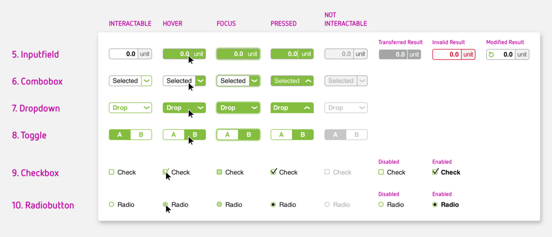
All modules have five different statuses or indicate a status of ...
- Interactable – the user can interact with the input module
- Hover – the cursor is now on an input module
- Focus – the use has selected the module with the keyboard
- Pressed – the module has just been clicked
- Not interactable – the user cannot interact with the module at this point
Toggle buttons, checkboxes and radio buttons also have the following statuses:
- Selected – the module has been selected
- Deselected – the module has been deselected.
There are four further special statuses for input field modules:
- Calculated result – the displayed value has been calculated from the data entered by the user or other data
- Transferred result – the displayed value has been transferred from the input or calculation in an overlay
- Invalid result – the value is outside parameters for permissible entries: the user should check the data
- Modified result – the standard value provided by the system has been modified by the user (and can be reset).