Naming
Catchy, short and easy to spot: all Reflex apps have their own name which is simple and to the point, such as Reflex Smart City or our design app Reflex Solutions Pro.
We use the prefix ‘Reflex’ in the descriptive text when naming apps (as in the above paragraph) but on the homescreen of users’ smart phones or tablets, we drop this for the app's name as the Reflex logo in the app icon covers this.

App icons
All our app icons (including desktop icons) fall into clear groups and are characterised by high recall. Each design basically consists of the following elements:
1. Logo
All app icons include the Reflex logo. There is a special and unique way for you to do this which is the significant and only exception to our strict guidelines on how to use the logo. In app icons, and only in app icons, the logo is placed without the strapline and with an outline.
2. Graphic elements
Graphic elements are at the heart of the design concept for our icons. They should represent the sense or function of the app in a heavily reduced, abstract form. For example, in the icon for the Reflex Control Smart app, there are two overlapping (wireless) waveforms which represent communication between the Reflex product and the app.
3. Background colour gradation
When designing icons, we work with an element which is not included anywhere else in the design manual: a colour gradation in the background of the icon. It starts with our specific Reflex green and merges into an appropriate colour.
Special features for Android
The app icon looks different on devices running Android depending on the manufacturer: from a square to a circle, from a box with rounded corners to a ‘squircle (a cross between a square and a circle). Please note this difference when designing the icon. It must suit all platforms.
The icons can also be animated on Android devices (e.g. with parallax effect or increasing in size when tapped). Use two layers for this. Layer one is the background with the colour gradation and graphic elements. Layer two is the foreground: the Reflex logo.
See the section Smart City for more information on apps.
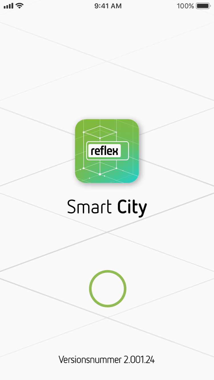
Loading screen
The loading screen (also known as the splash or home screen) is displayed as soon as the user starts a Reflex app or launches a web app. This screen performs two functions: first, it provides a friendly welcome to the app. At the same time, it serves as a placeholder while the content is loaded in the background.
Our loading screens always contain the following information:
- The app’s icon which is loaded immediately
- The name of the app which shows how far the loading process has progressed
- Loading circle which shows how far the loading process has progressed
- Current version number
- Background graphic (this picks up the design elements of the app icon)
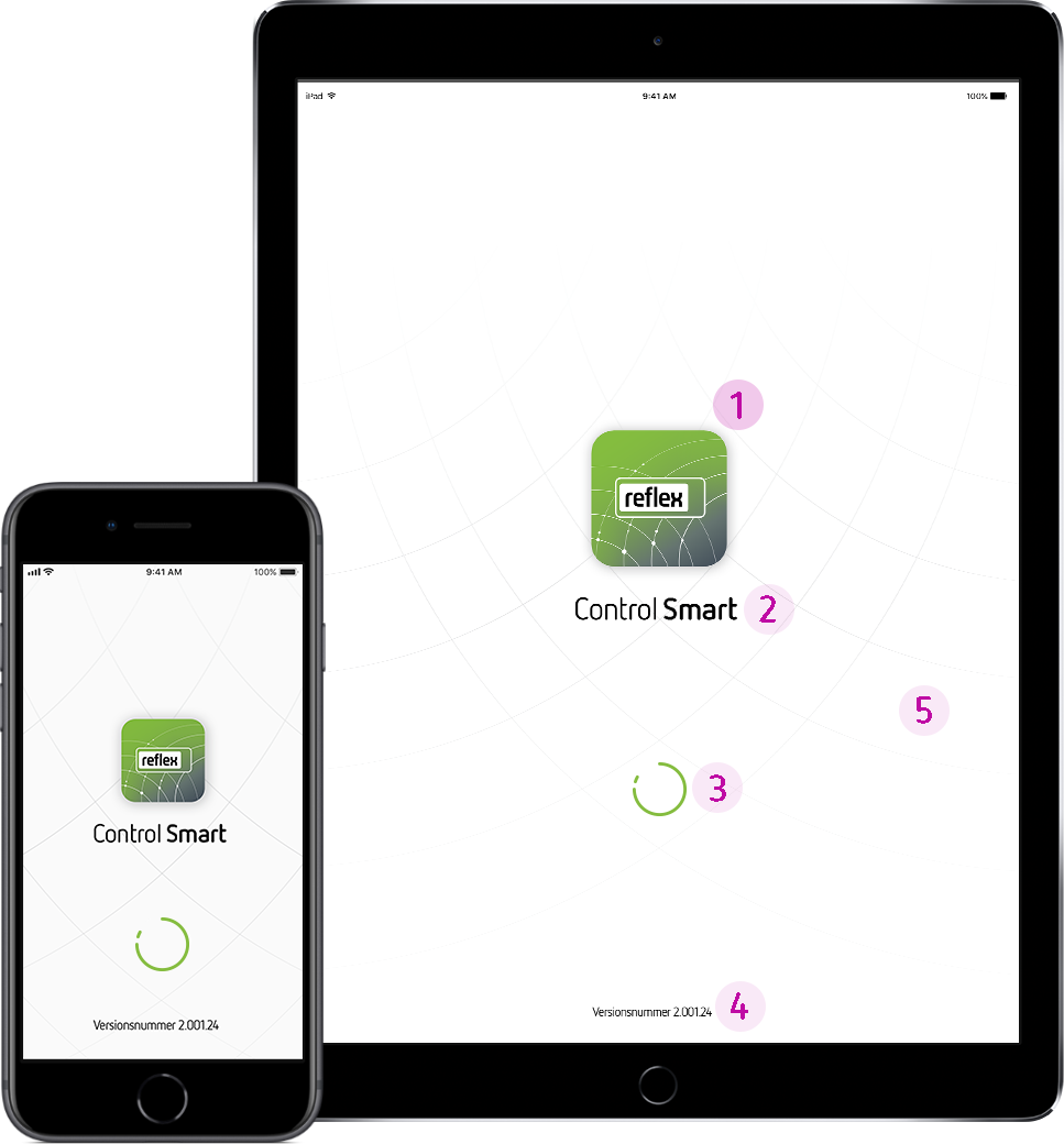
Formats
Please take care to adapt the loading screen to the various formats so that all essential elements are always clearly visible.
Interface
1. Logo
As with all digital applications, the Reflex logo is placed on the left. Please ensure the Reflex logotype has a minimum white space height and width of ‘r’ on every page.
2. Buttons
The design of the input mode (buttons) is clearly based on the stylistic idiom of the logo. This means that buttons are rendered as rectangles with rounded corners. Please use a solid Reflex green for the interactive elements that you want to emphasise.
3. Icons
Would you like to include icons in your interface? Then use the Reflex UIcons set .
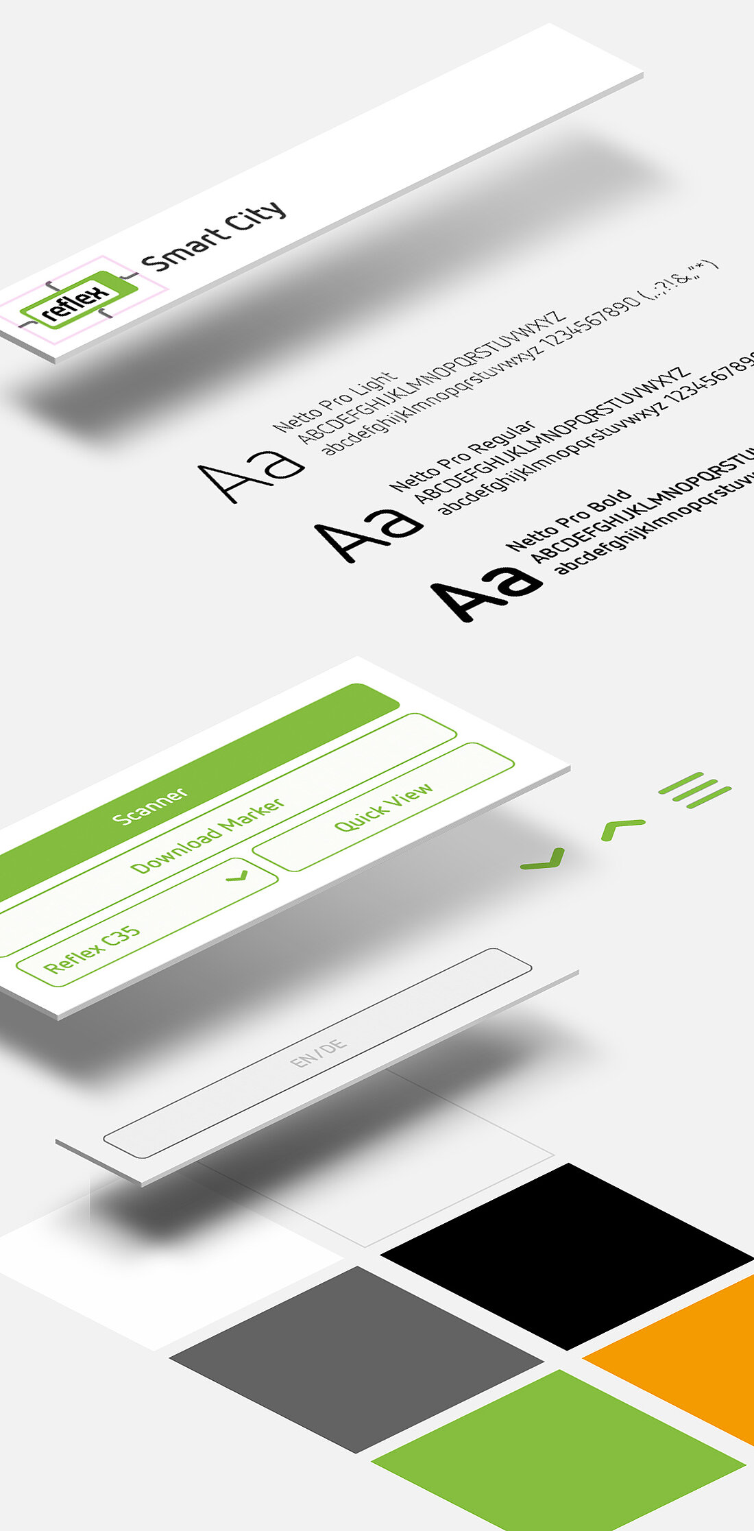
4. Font
All text in the interface is to be written in our corporate font Netto Pro.
App Store entries
Several Reflex apps are available from App Store or Playstore. Please select a preview image for this so that future users can see what the app offers at a glance. Descriptive texts provide a clear and informative explanation of the app; they are short and to the point. Furthermore, make sure you observe Apple or Google’s current store requirements.
Best Practice:
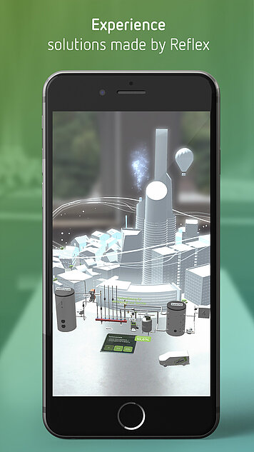
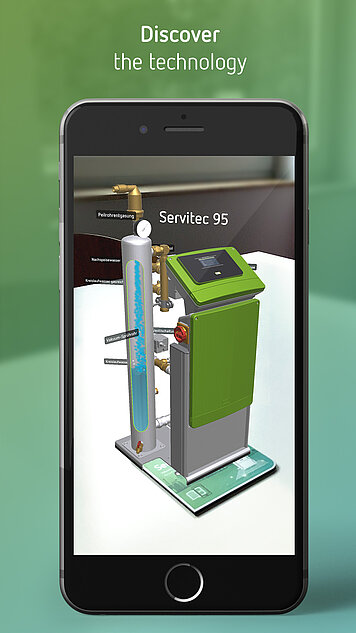
Thinking Solutions: We think in solutions and network out of conviction. We share our knowledge and know-how. The Reflex Smart City app is a very good example of this.
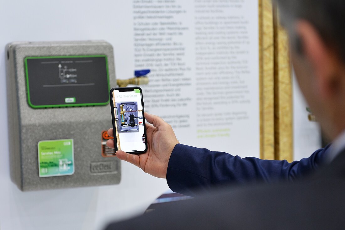
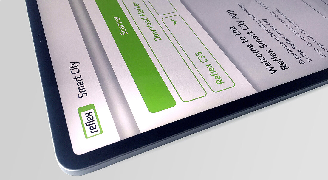
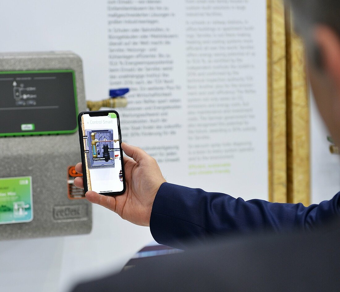
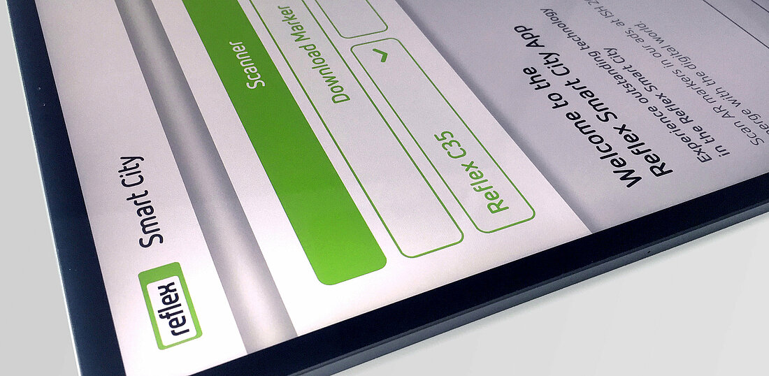
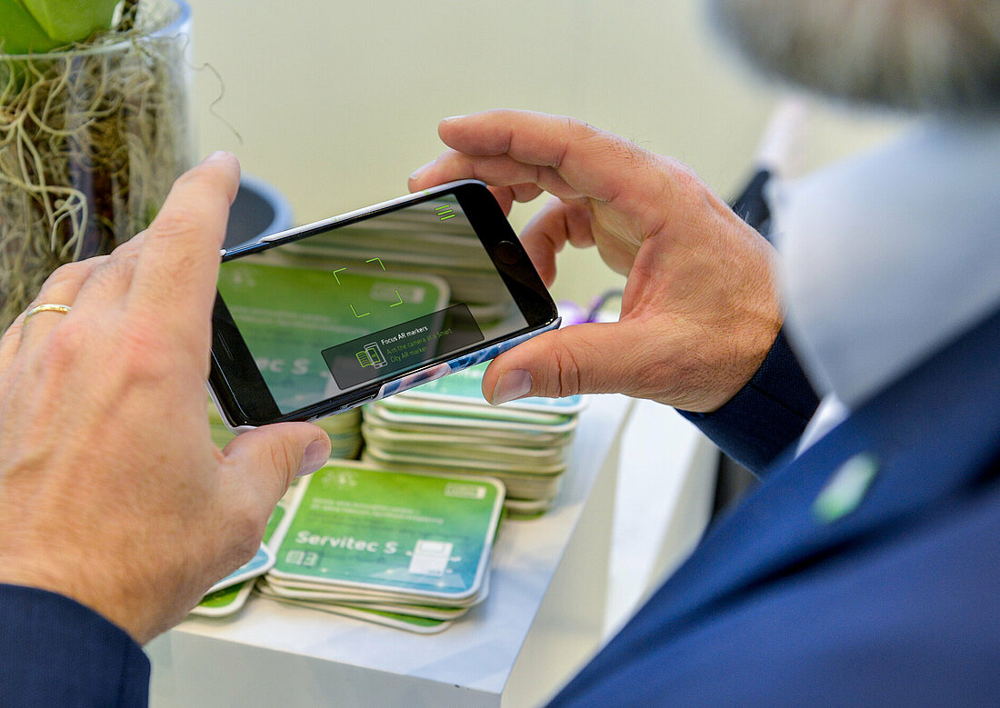
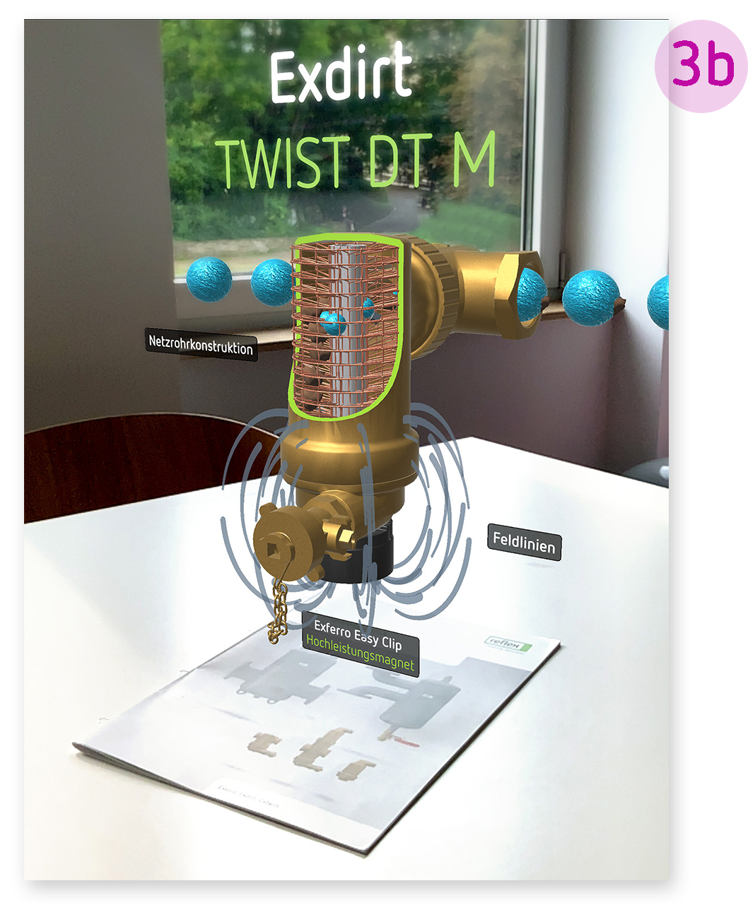
The Reflex Smart City app is a new self-explanatory and interactive way for users to discover Reflex City. It operates via the Reflex Augmented Reality Marker which we use to mark our products at trade fairs, on our website, in advertisements or brochures. The user scans the marker with the app and is taken virtually into the inner world of the scanned product. He or she is intuitively presented with the essentials of the function, design and benefits of our products’ functionality.
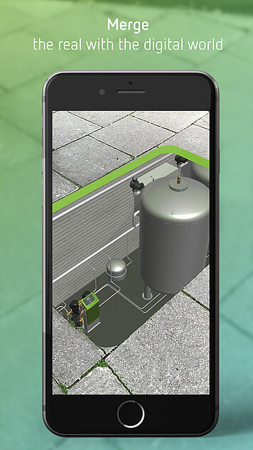
Freely accessible information architecture
We designed access to all our digital applications to be as easy as possible. Our users should be able to benefit from the content of our apps with minimum impediment. This is equally true of our Reflex Smart City app. The content of this app is explored and discovered using the physical components of the AR markers and the exhibits. The purely digital content in the app is therefore reduced to a minimum.
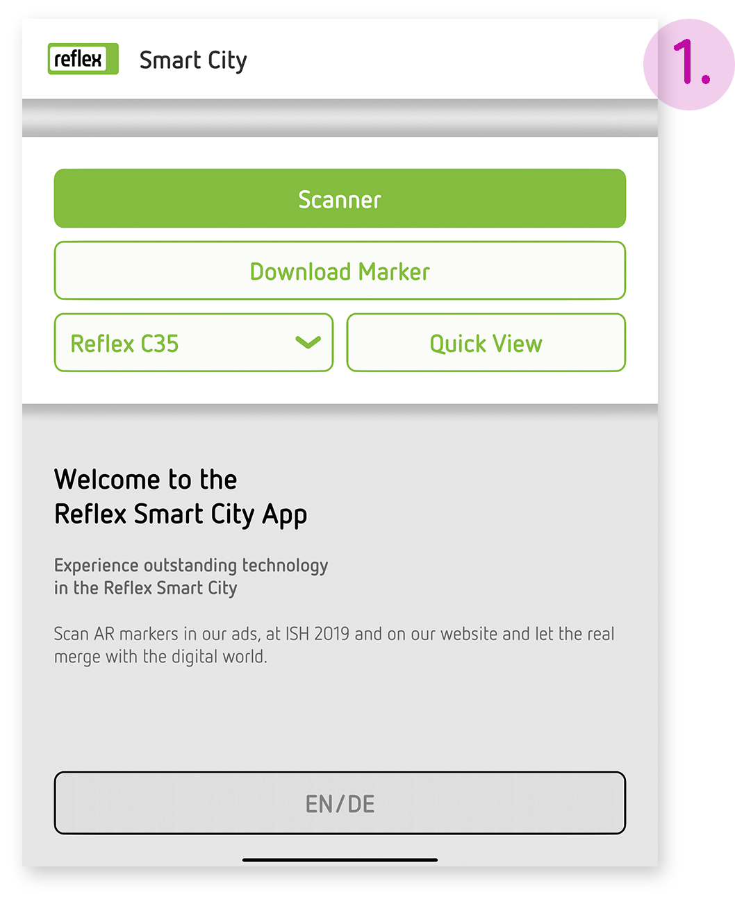
1. Main menu
The first step takes the user to the main menu which provides the following options:
2. Quick view
The quick view allows the app to be used without AR markers. The user is presented with a video preview of the product animations.
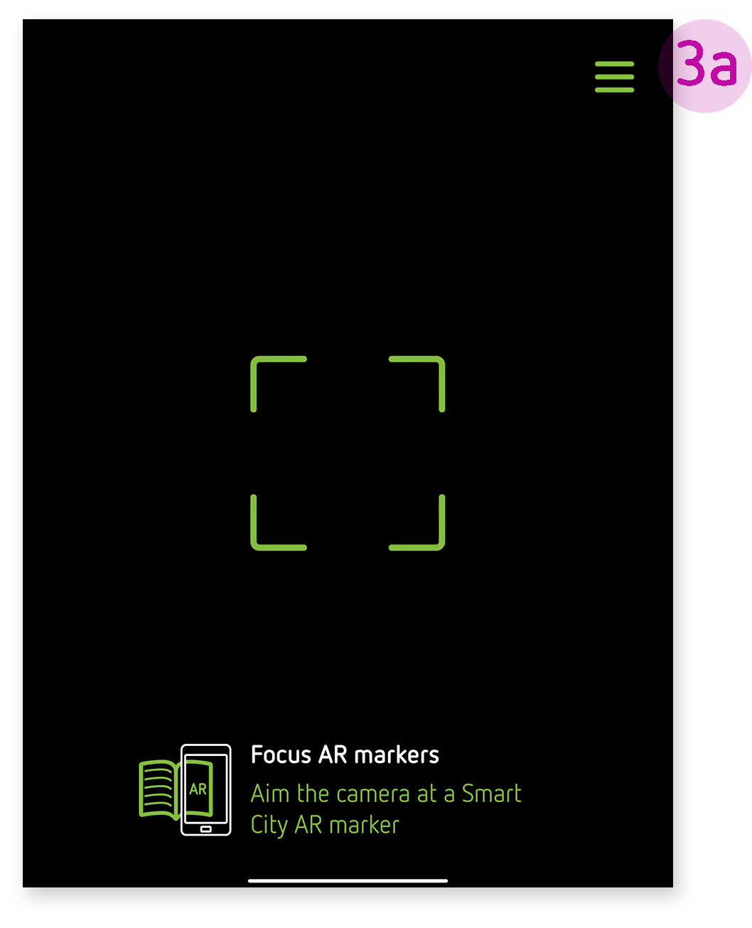
3. Scanner
If the Scanner option is selected, this activates the terminal device’s camera: a crosshair marks the viewfinder and a short help text provides practical instructions for first-time users. If the user scans an AR marker, the interface is hidden. The user then dives straight in and can concentrate fully on the AR experience.

Best Practice:
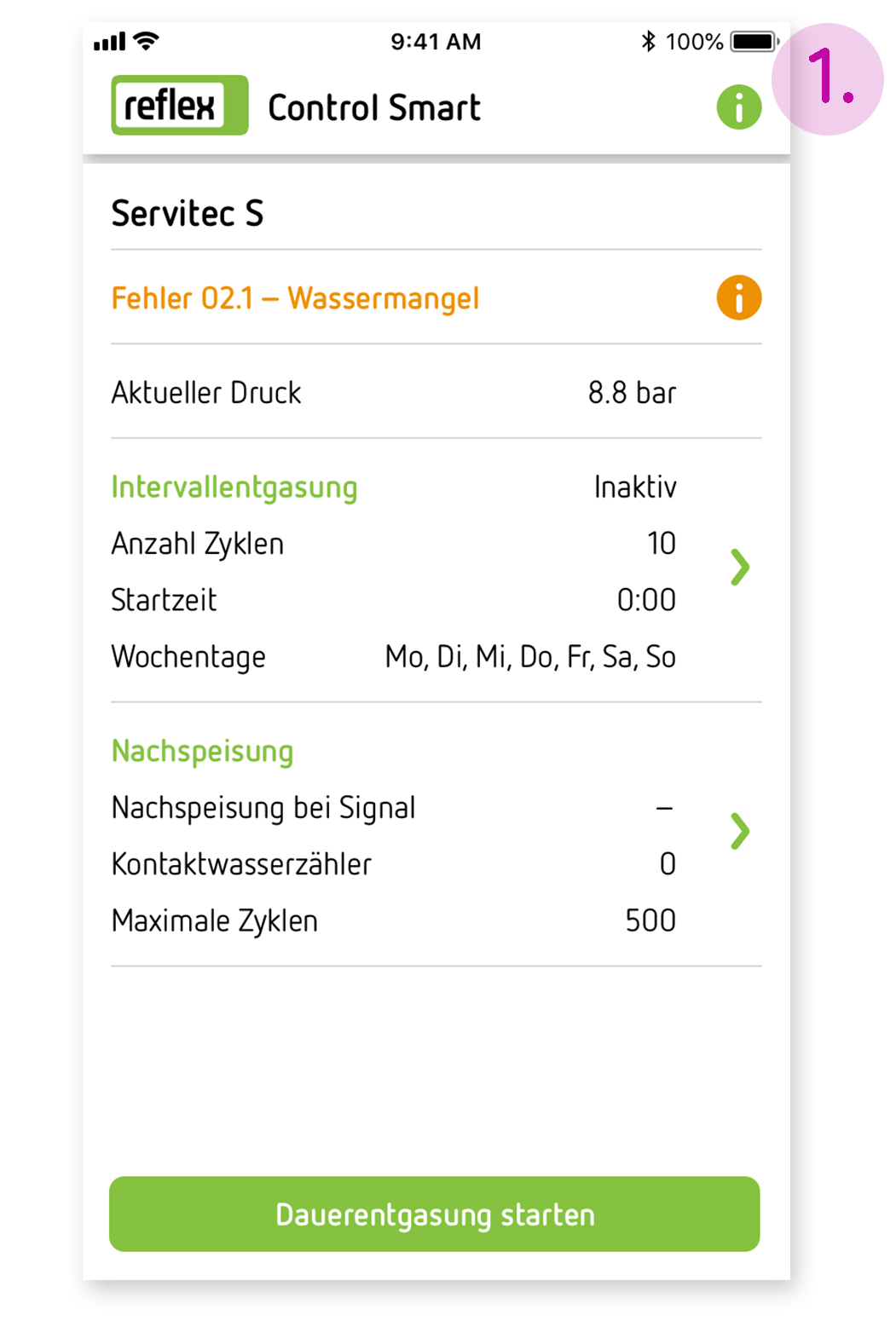
Progress must always make sense which is why our Thinking Solutions are ready for immediate use. We have developed them to be easy to install and operate. There is even an app for Servitec S and Servitec Mini: Reflex Control Smart.
Our Reflex Control Smart app provides users with Bluetooth access to Servitec S and Servitec Mini on their smart phone. The app also provides installation engineers with easy-to-understand support when commissioning Servitec. And our end users can use the app to set their own specific degassing times such as days of the week and time. The Reflex Control Smart app also displays fault messages such as when insufficient water is detected.
Freely accessible information architecture
Our apps make full use of the benefits of digitalisation and make work easier. We have therefore also kept their information architecture as freely accessible as possible. Install and go!
- Home page
All the essentials at a glance: The home page offers the user an overview of the settings. It also clearly shows any fault messages.
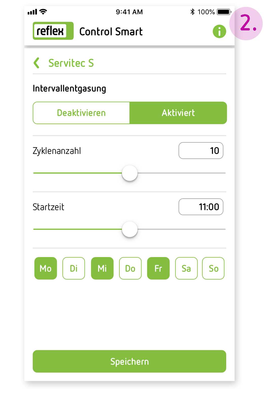
- Settings
In Settings, the user can set the degassing mode parameters (continuous or intermittent operation, number of cycles) as well as the days of the week and time. The system pressure is also checked at this information level.
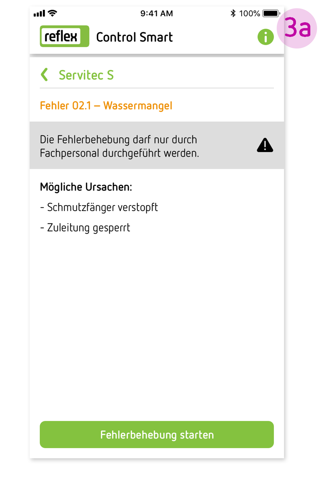
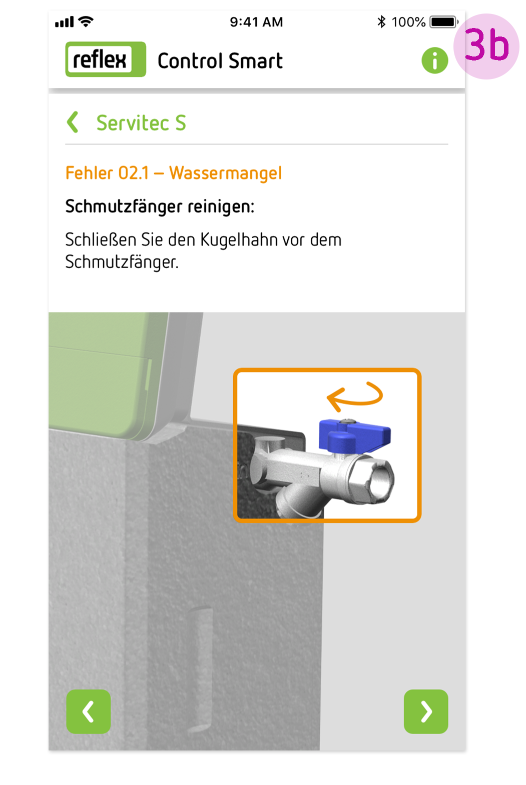
- Troubleshooting
Maintenance and troubleshooting: The app shows the relevant component on the device. The user can see what needs to be done at a glance.