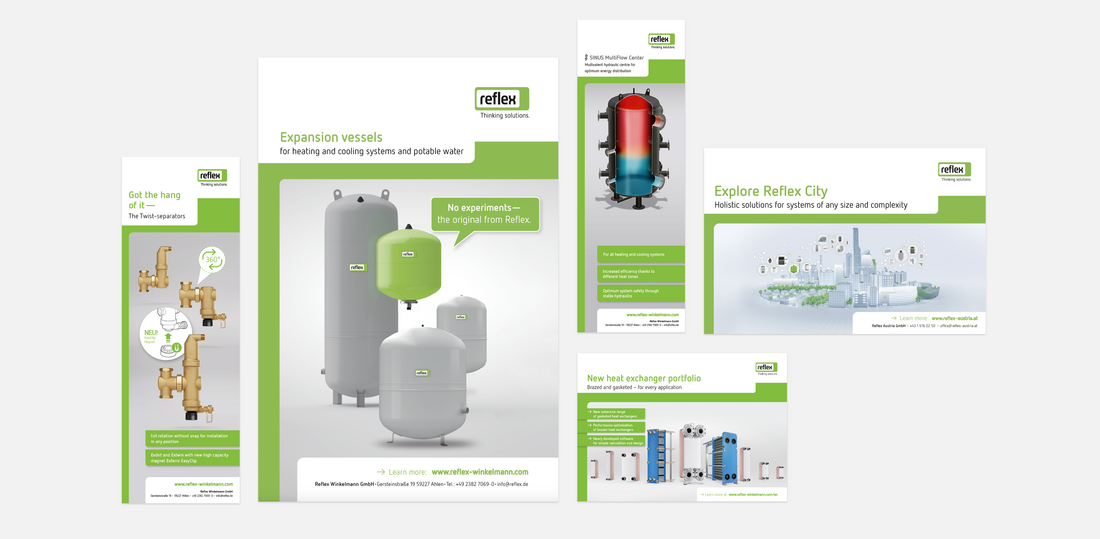
Advertisements
Portrait product advertisements
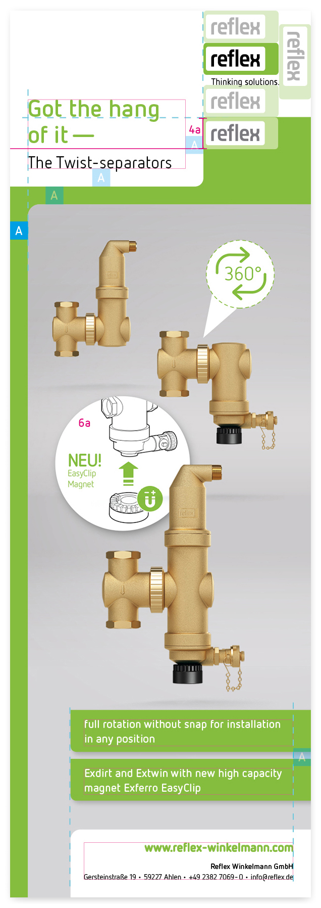
Logo
The logo is always located in the top, right-hand third. The minimum size must be maintained: for further information on this, see The logo – size in this manual. Please also ensure that the distances are always maintained as defined in the section The logo – one logo height above, below and to the right.
Distance A
Distance A provides your advertisement with visual cohesion. It is mandatory to the left, right and below. Distance A also defines the distance below and to the right of the headline and the hook. Finally, distance A also defines the width of the green frame to the left and above the image.
Please also observe the following features when designing your advertisement:
Title
The title must reflect our corporate language and be formulated along the lines defined by our corporate language principles.
Typography: Netto Pro bold, Reflex green. Character spacing -15, kerning: metric.
If you are including a subtitle, for example, to add essential information to the title, this is to be set in Netto Pro regular, black.
The font sizes for the title and subtitle should have a ratio of approximately 1.0 (title) to 0.7 (subtitle), i.e. 25 pt (title) * 0.7 = 17.5 pt (subtitle).
Title as hook
All our advertisements have the same striking header: the title is surrounded by a white frame which acts as a hook into the upper section of the advertisement image. Visually, this brings the title to the front and makes it more accessible and easier to read. The hook around the title always finishes justified to the left-hand edge of the logo and surrounds the title at a distance A but at a minimum of a logo height (4a).
The right-hand lower corner is rounded As a guideline, the corner radius R should have a ratio of width*0.03 (example: 60mm width * 0.03 = corner radius ~2mm). This radius is then used for all other rounded elements in the advertisement.
Green frame
The frame is produced in Reflex green. Therefore, Reflex advertisements may not be produced without a frame in our high-impact brand colour!
Image
We generally use images of typical products from our portfolio when composing product advertisements. Depending on the advertisement image, add-ins (6a) can be included as an attention-grabber.
USP boxes
What is our message? Our USP boxes (unique selling points) allow us to highlight particular features of the product or product segment. Please write precisely, concisely and with confidence. Do not use more than three USP boxes in a single advertisement. USP boxes come into the image from the right-hand or left-hand side without overlapping any important product details. A shadow (black, 30% opacity) again lifts the boxes off the page.
Source hook
The lower hook clearly identifies Reflex as the source.