


Brochure title
1. Logo
Position of upper right-hand corner (X | Y): 195.2mm | 15mm
Size (W×H): 35.2mm × 20.5mm
2. Title
The title comprises one, maximum two, lines. It can be supplemented with a subtitle. The base line for the first line is always the right-hand upper edge of the image.
Position of upper left-hand corner (X | Y): 15mm | 48mm
Title font: Netto Pro Bold, 30pt/36pt, Character spacing: -15, kerning: metric
Subtitle font: Netto Pro regular, 19pt/24pt, Character spacing: -20, Kerning: metric

3.Title as hook
All our brochures have the same striking header: the title is surrounded by an intentional frame which acts as a hook into the upper section of the cover image. Visually, this brings the title to the top and makes it more accessible and easier to read. The (intentional) frame around the brochure’s title always ends justified to the left-hand edge of the logo. Further information on the design of hooks is available in the section Advertisements.
Position of upper left-hand corner (X | Y): 0mm | 57.52mm
Size (W×H): 160mm × 21.17mm
Corner radius: 5mm
4. Cover image
Position of upper left-hand corner (X | Y): 0mm | 57.52mm
Size (W×H): 210mm × 239.48mm
5. Lower hook
Relevant information at a glance: The lower-right hook summarises the content of the brochure in one sentence.
Position of upper left-hand corner (X | Y): 102.5mm | 277,65mm
Size (W×H): 107.5mm × 19.35mm
Corner radius: 5mm
6. Stitching
Our product brochures are always stitched with four loop staples so that they can be easily added to our planning files.
Inside pages

Design elements
Information at a glance, including useful design elements for the inside pages of brochures.
1. Notes box
The notes box is intended for content that needs to be highlighted. It can include relevant links (videos, websites) or other publications, highlight particular safety considerations, or provide other important information. Each notes box has an icon which corresponds to the content. These icons can be found in Part 3 of this manual: Communication-related icons.
The boxes have a defined width: the height is dependent on the amount of text. Whether on the right or the left, all notes boxes run from the edge of the page. They are lifted off the page by a shadow (black, 20% opacity).
2. Title box
The title box indicates the start of a product section. They always followed by the following information: product images, technical features and a product table.
3. Technical features
Please list all the important features of the product in a two-column format. Please note: the grey banner is always on the left.
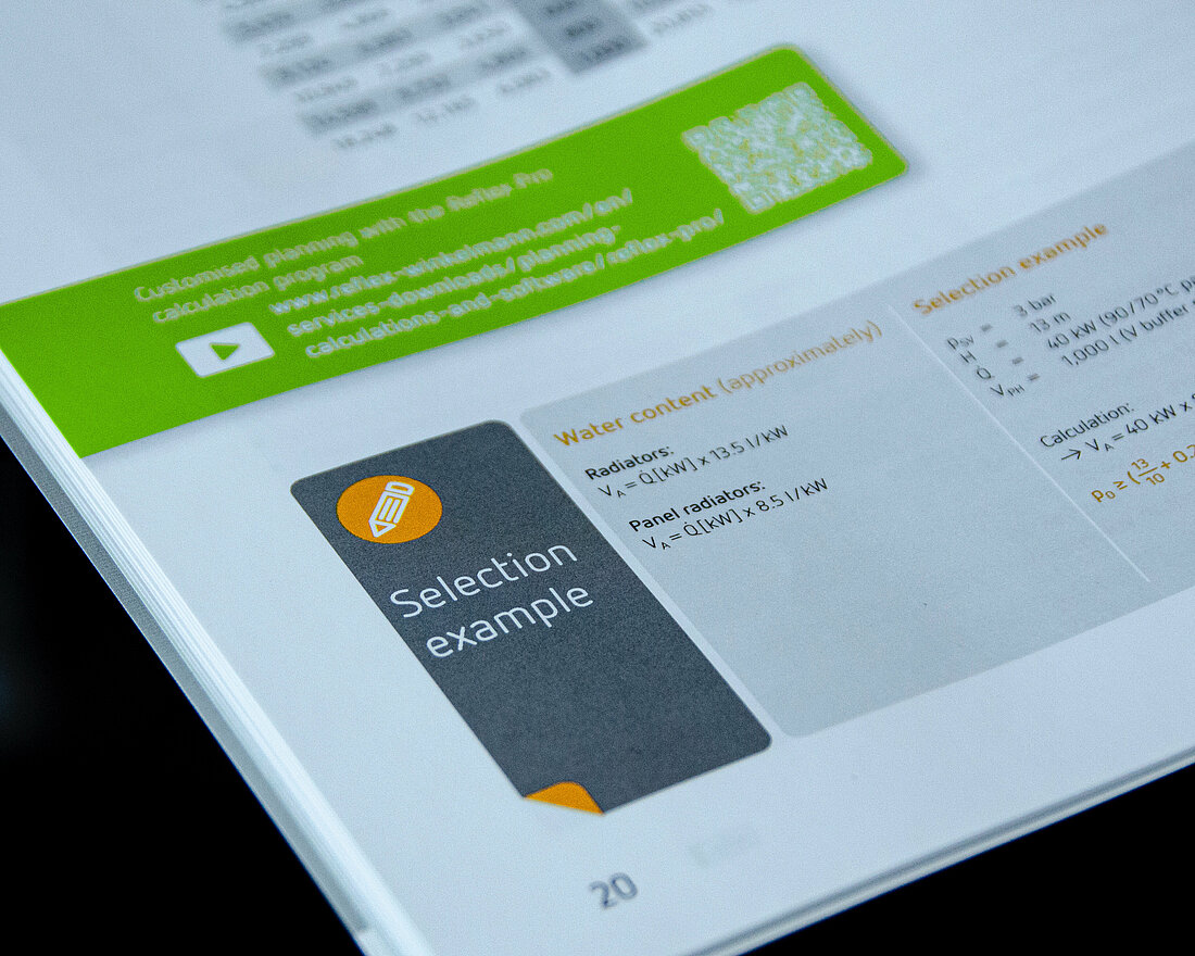
4. Product table
The product table starts on the left with the product name (please enter this as ‘left-justified header’) followed by all the relevant data (please enter this as ‘centred header’). The lines alternate grey and white. Practical know-how at a glance: the permissible operating pressure and temperature are provided in the banner on the left. The units of measurement are given in the table’s header in square brackets.
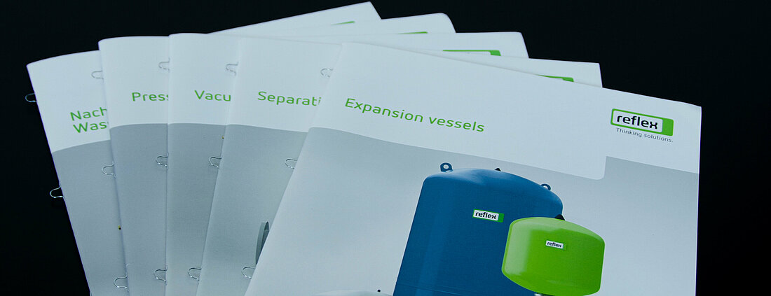
Section dividers
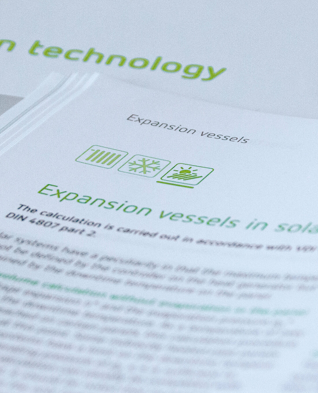
Finding instead of looking: section dividers help our readers go to where they want to be in the brochure immediately. Isometric technical drawings are used as product illustrations on these dividers. Illustrative techniques are used to elaborate them in such a way that the product is immediately recognisable.

Back cover
Our brochure back covers (page 4 of the cover) have a uniform design. They therefore always include the following:
1. Reflex Logo
Position of upper right-hand corner (X | Y): 195.2mm | 211mm
Size (W×H): 35.2mm × 20.5mm
2. Divisional logo
The divisional logo is always positioned below the Reflex Logo. It is 1.5 times wider than the Reflex logo and is aligned to text baseline.

3. Address
If your address requires more lines than shown here as standard, just extend the address field (and move the Reflex logo) upwards as required. The minimum distance to the URL at the bottom of the page must be maintained.
4. URL
We use an extra-bold variant for the URL. This is available in the EPS files.
5. Material number
The material number is included here together with the date of publication, the edition, and the legal notification ‘Subject to technical modifications’.
Special mini-brochures
Specific typography
The role of our brochures and printed material is to present information clearly and accessibly. We also make use of typography to achieve this. Therefore, please adhere to the following typographical principles:
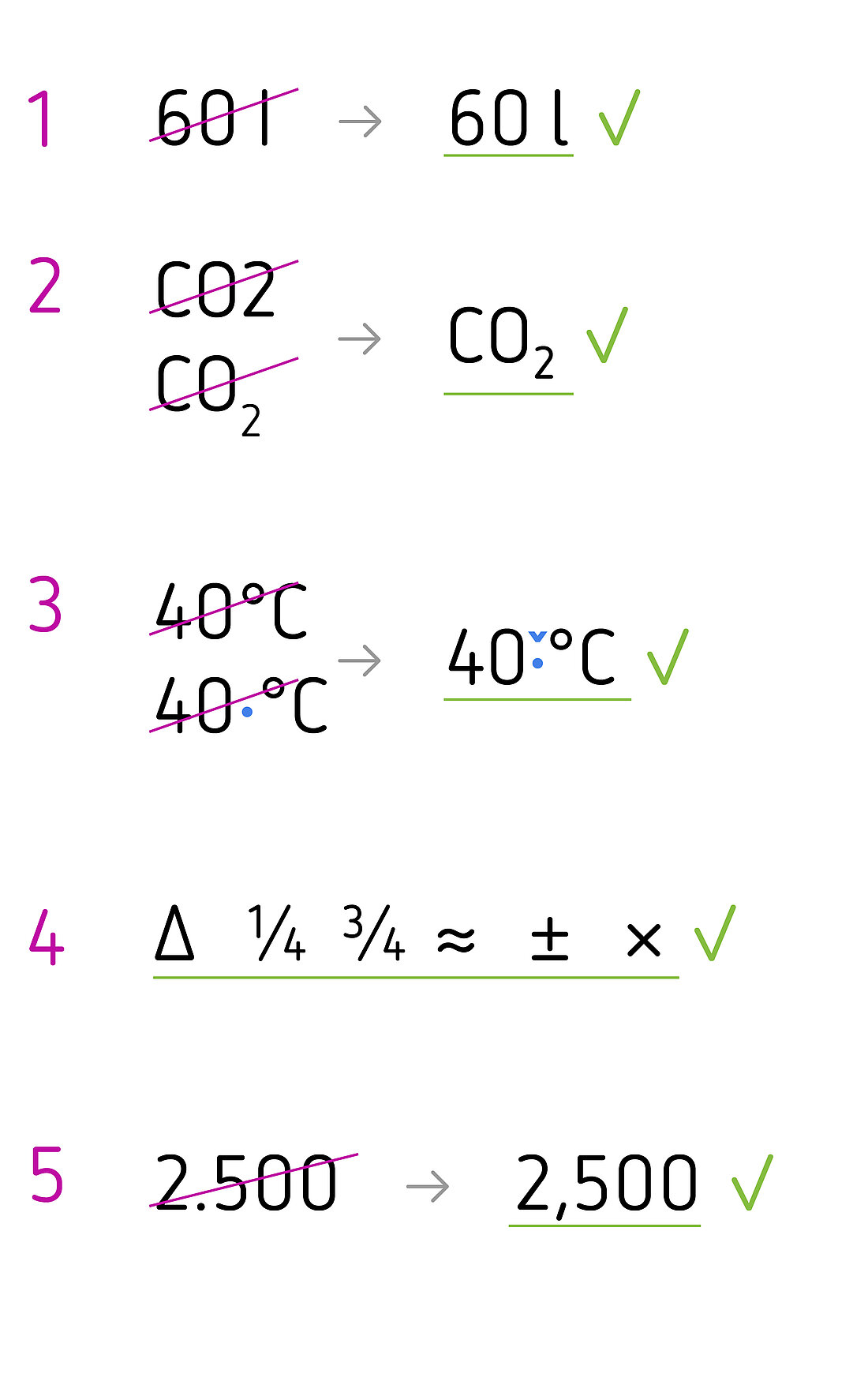
- We use the stylised alternative Netto Pro for lower case ‘l’ on its own, such as when specifying litres, due to its increased legibility.
- We use glyphs for subscript characters, as in CO₂ (in this instance: U+2082).
- We insert an eighth em as the spacer between digits and symbols for units such as % or °C.
- Netto Pro has an extensive range of glyphs. Where possible, we therefore use mathematical symbols from this character set, for example, the Δ symbol (delta) and fractions.
- We observe country-specific formatting when setting foreign languages, for example, the thousands separator or when writing the date.