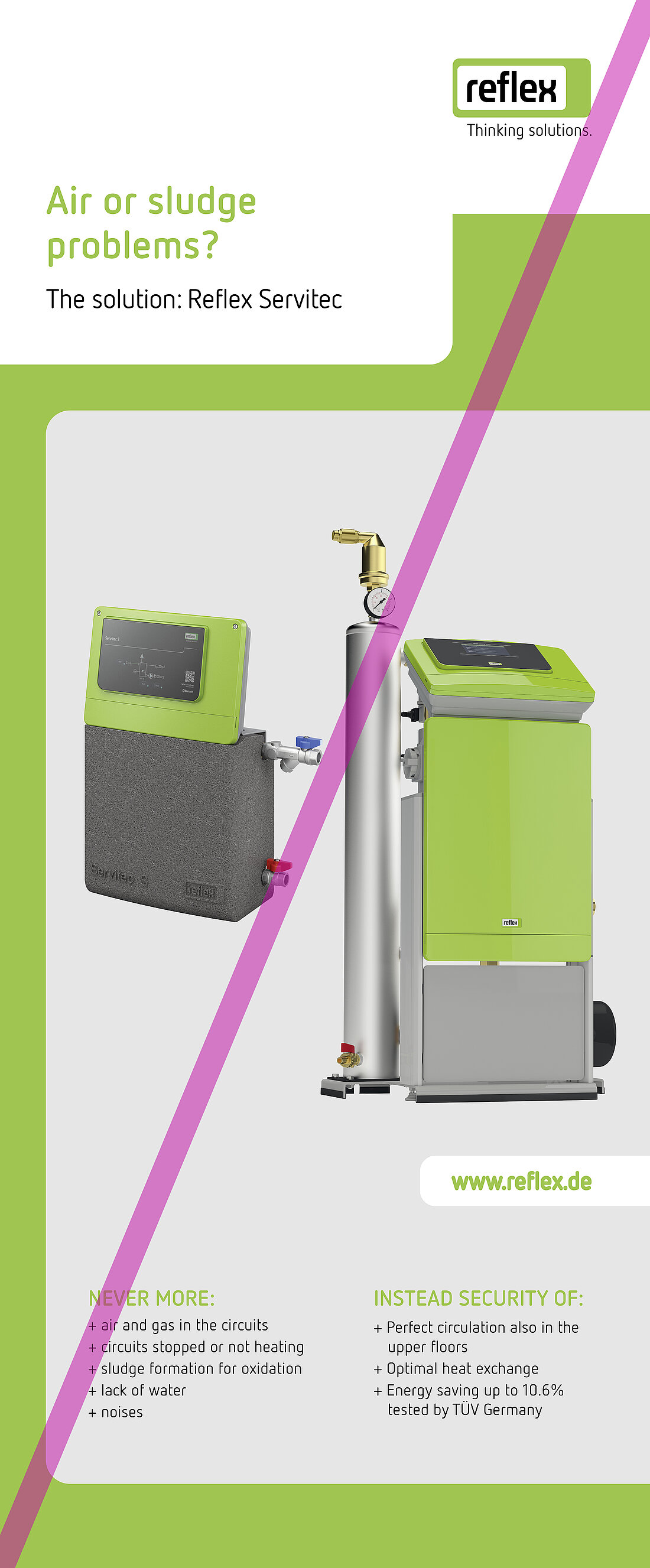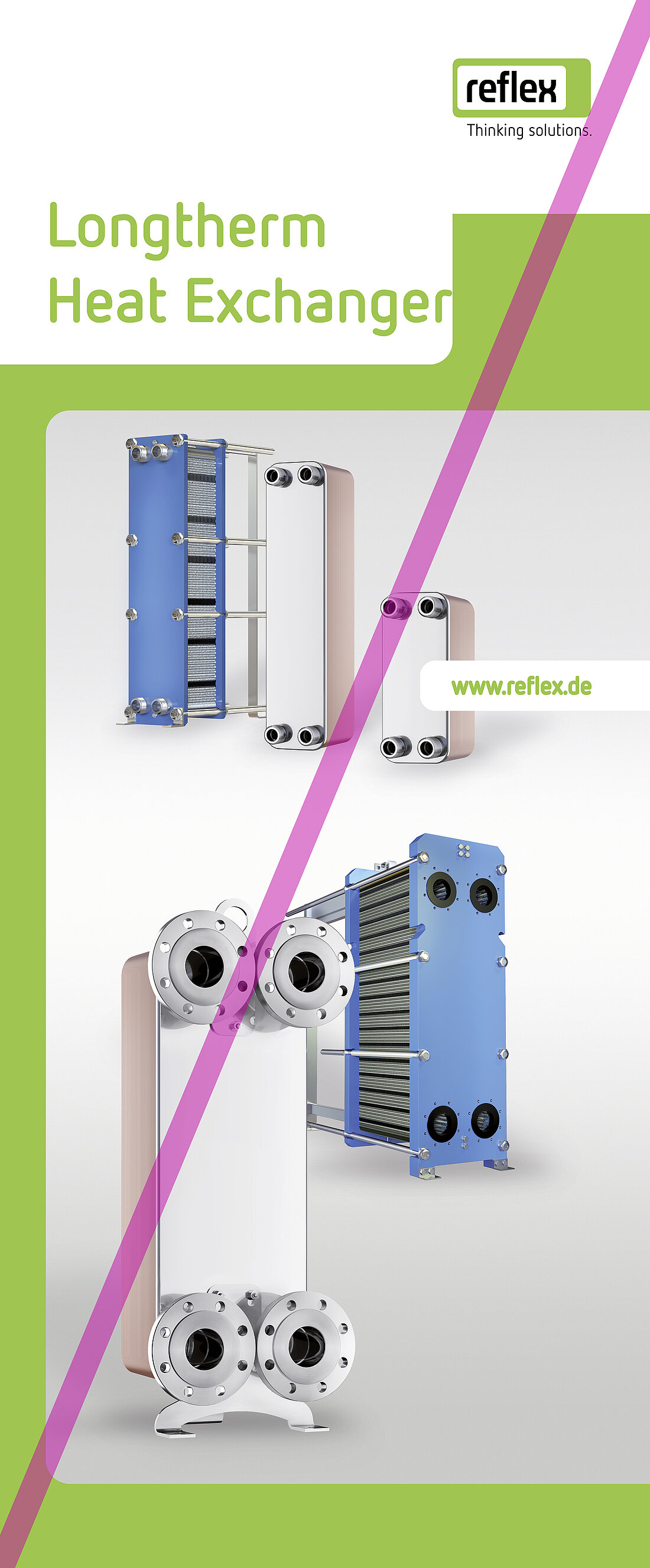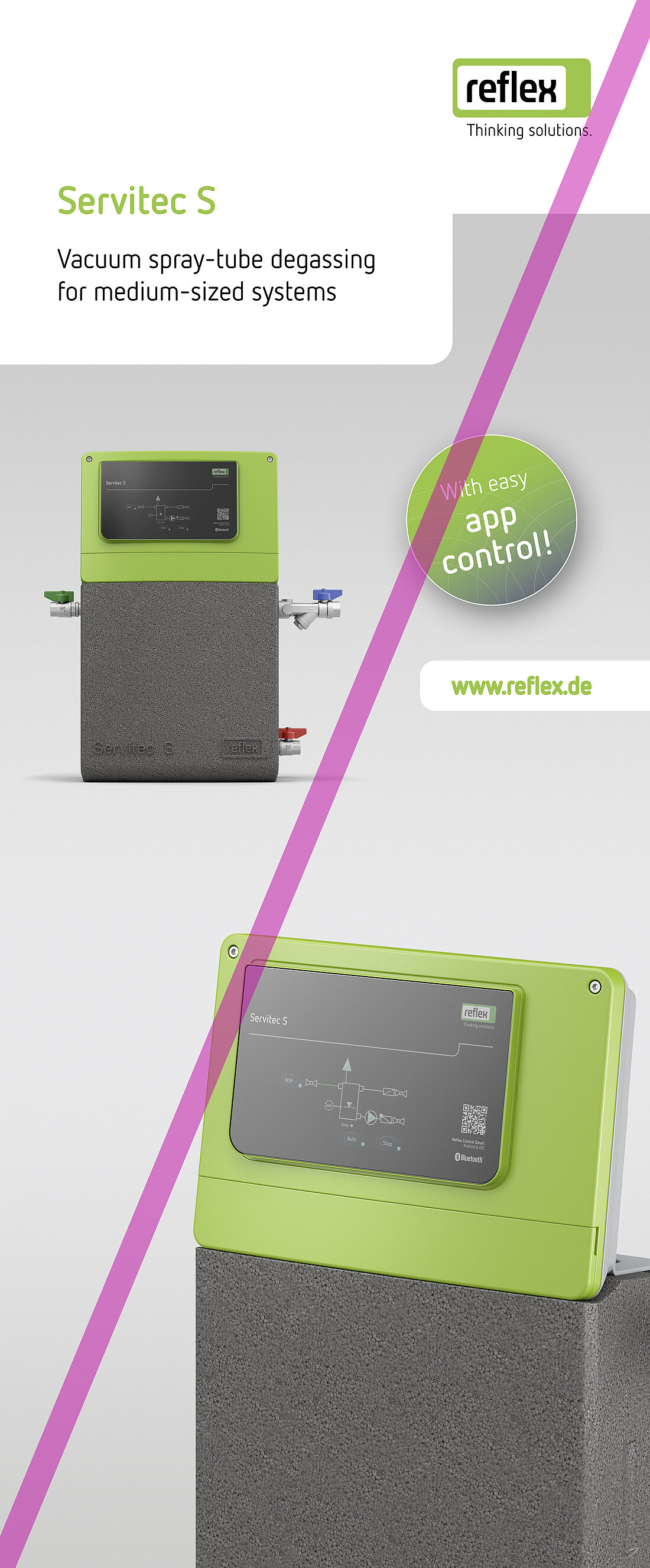
Design
Legibility
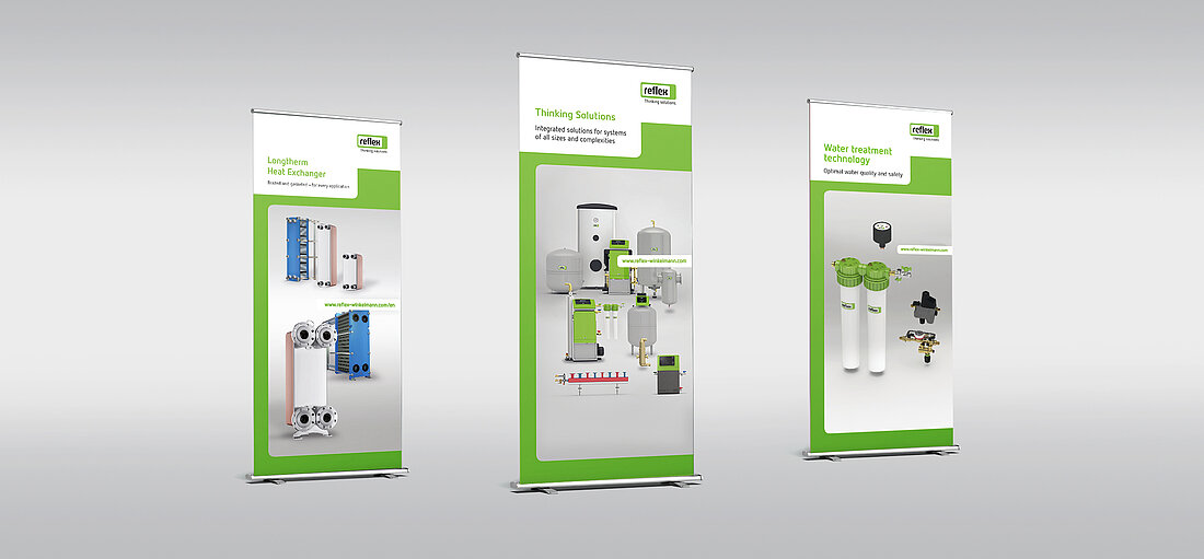
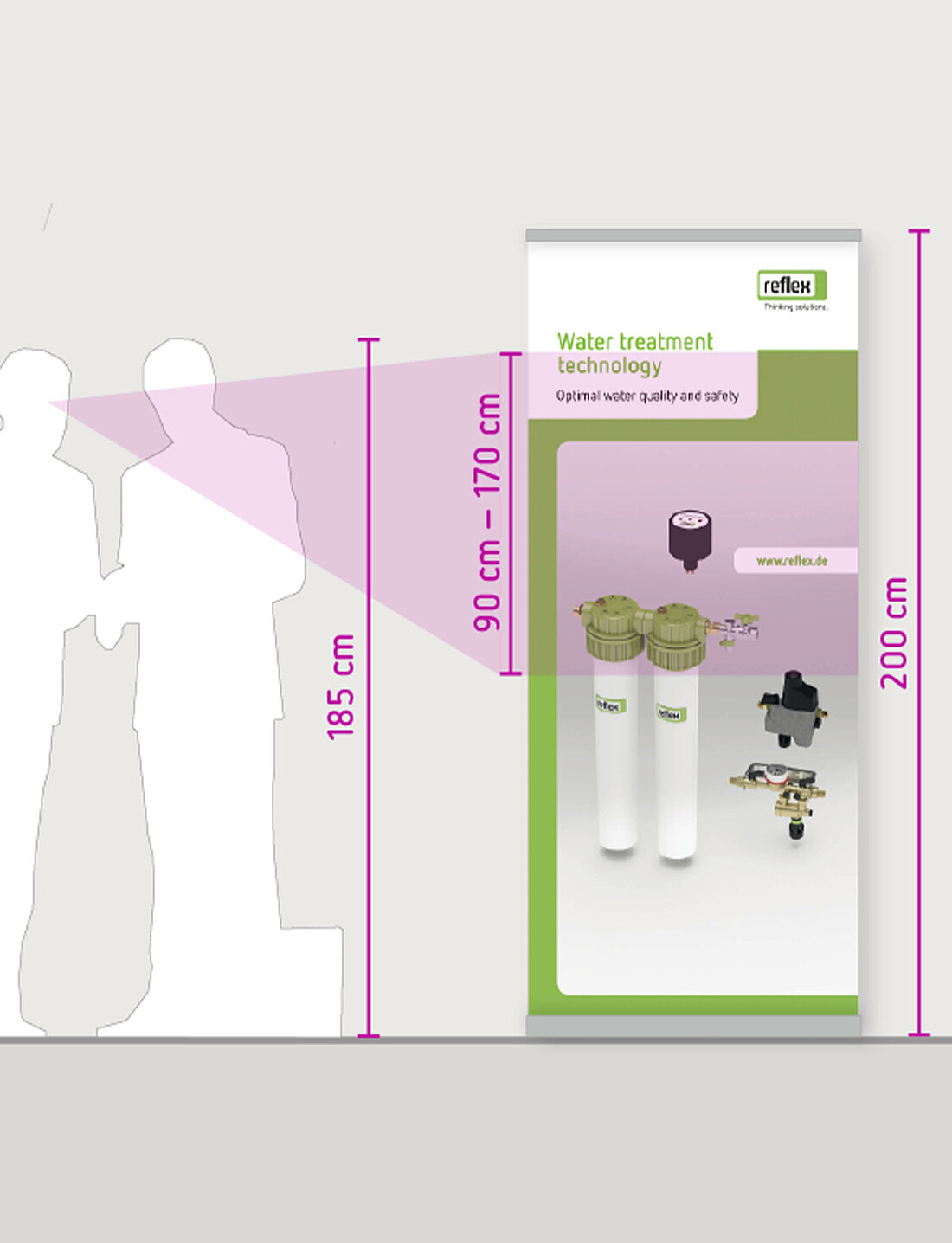
We prefer to use large roll-ups standing on the floor. The attract attention, but it is important to consider the correct reading height. Only a part of the roll-up is at a reading height which is comfortable for visitors. Please position your body text in the area from 90 cm to 170 cm (calculated from the floor level). Large headlines can be positioned higher up. Do not place text any lower than 90 cm. This area can be used for images.
1. Logo
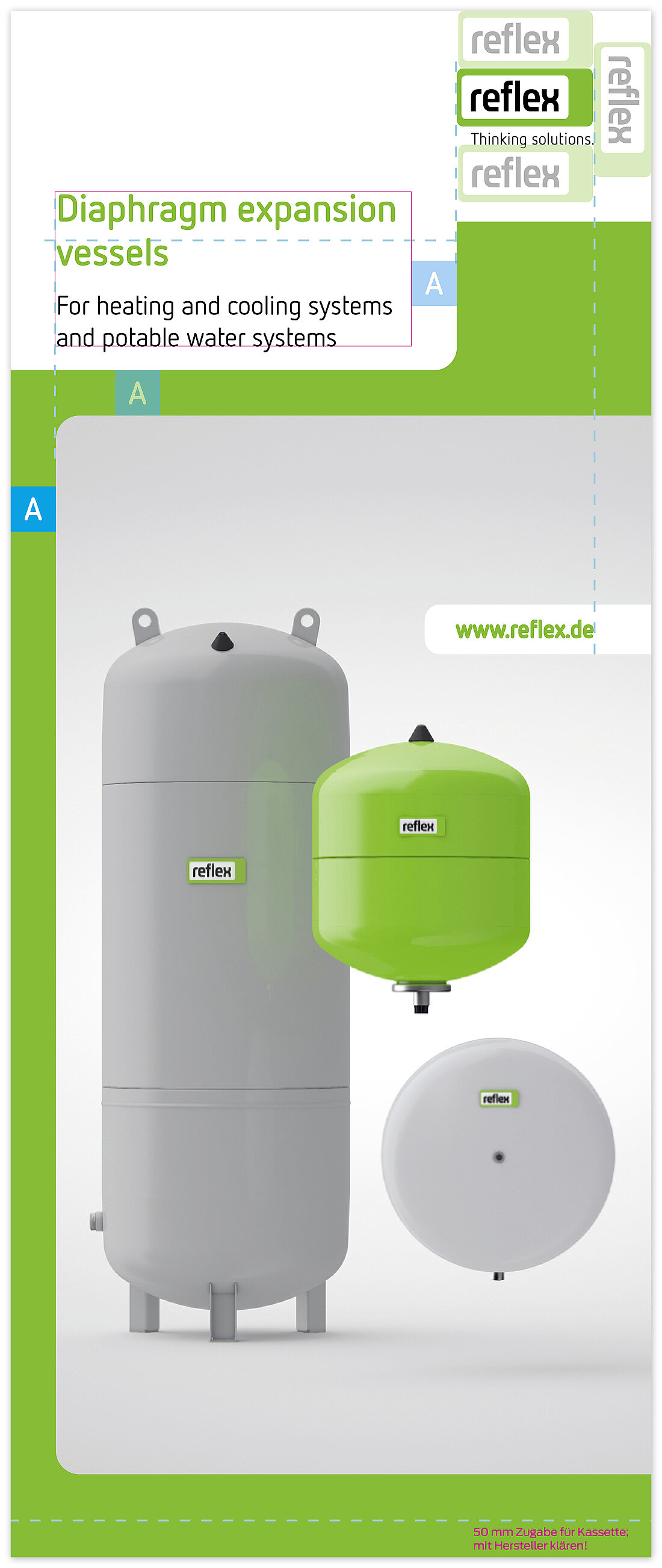
The logo is located in the right-hand third. Distances to the edge of the page and below are precisely defined in the section The logo.
2. Distance
Distance A is defined by the margins and is 6 cm for an 85 cm wide roll-up. Distance A is maintained to the left, right and below. It also defines the white space between the headline and hook on the right. Finally, distance A also defines the width of the green frame to the left and above the image.
3. Headline
Every Reflex headline is couched in our instantly recognisable corporate language.
Typography for the headline is FF Netto Pro bold, Reflex green, 145 pt. Character spacing -15, kerning: metric. The sub-headline, if present, is set in Netto Pro regular, black, 100 pt.
4. Green frame
Effective eye-catcher: every roll-up has a striking Reflex green frame.
5. Image
In general, please use images from our portfolio segment for your roll-ups. Always observe the reading height: as roll-ups stand on the floor, significant components of the image or information should not be included in the lower half.