Information hierarchy
Level 1: sender
Reflex Logo
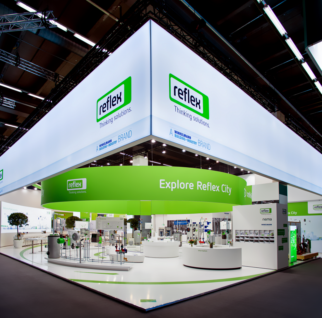
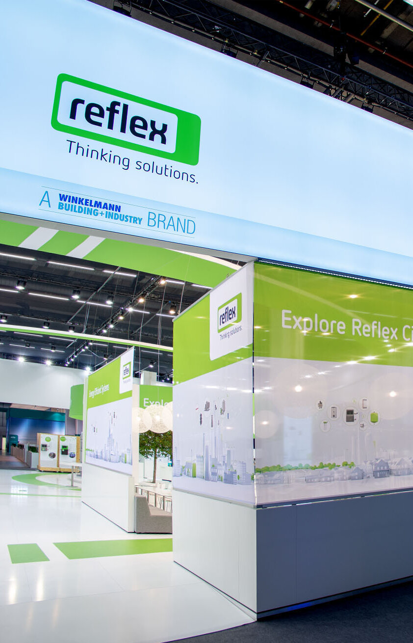
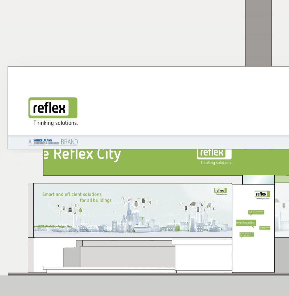
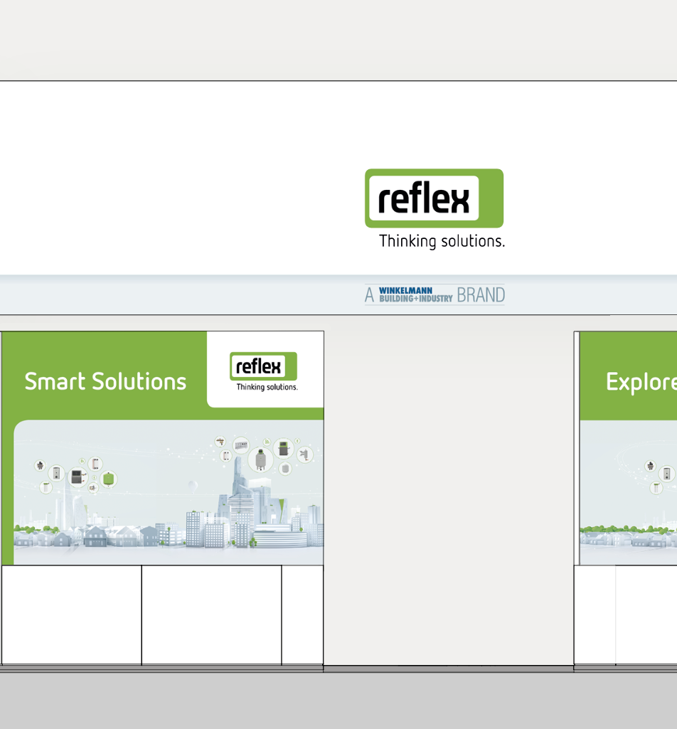
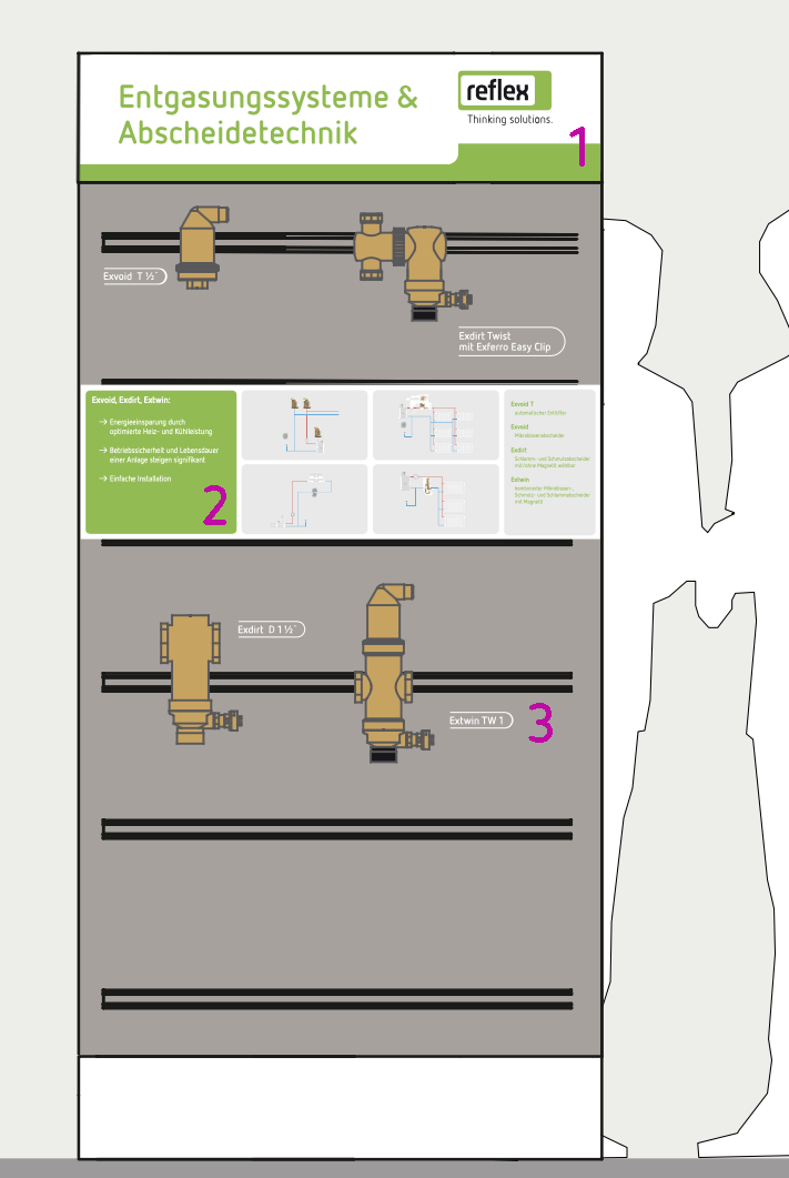
Our logo is the most important evidence of our brand on any trade fair stand. It must therefore be clearly visible and recognisable from any angle. We achieve this by placing it at level 1 which is generally as an overhead banner.
Our strapline ‘Thinking Solutions’ is inextricably linked to the Reflex logo. It promotes our main message: we think in solutions. We look at relationships, connections and detail. Our logo may not be used without our strapline on this prominent location on our trade fair stands.
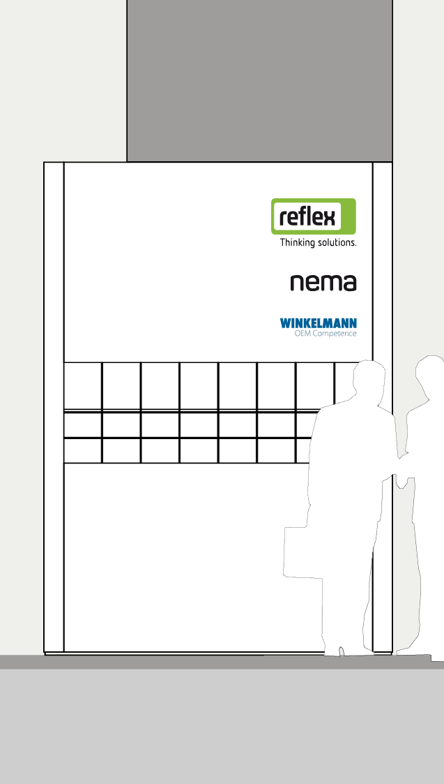
Divisional logo and other brand logos
When we communicate the Winkelmann Building+Industry division at trade fairs, the WBI logo is positioned below the Reflex logo. In terms of emphasis, it should clearly take a back seat to Reflex and be understood as a sender.
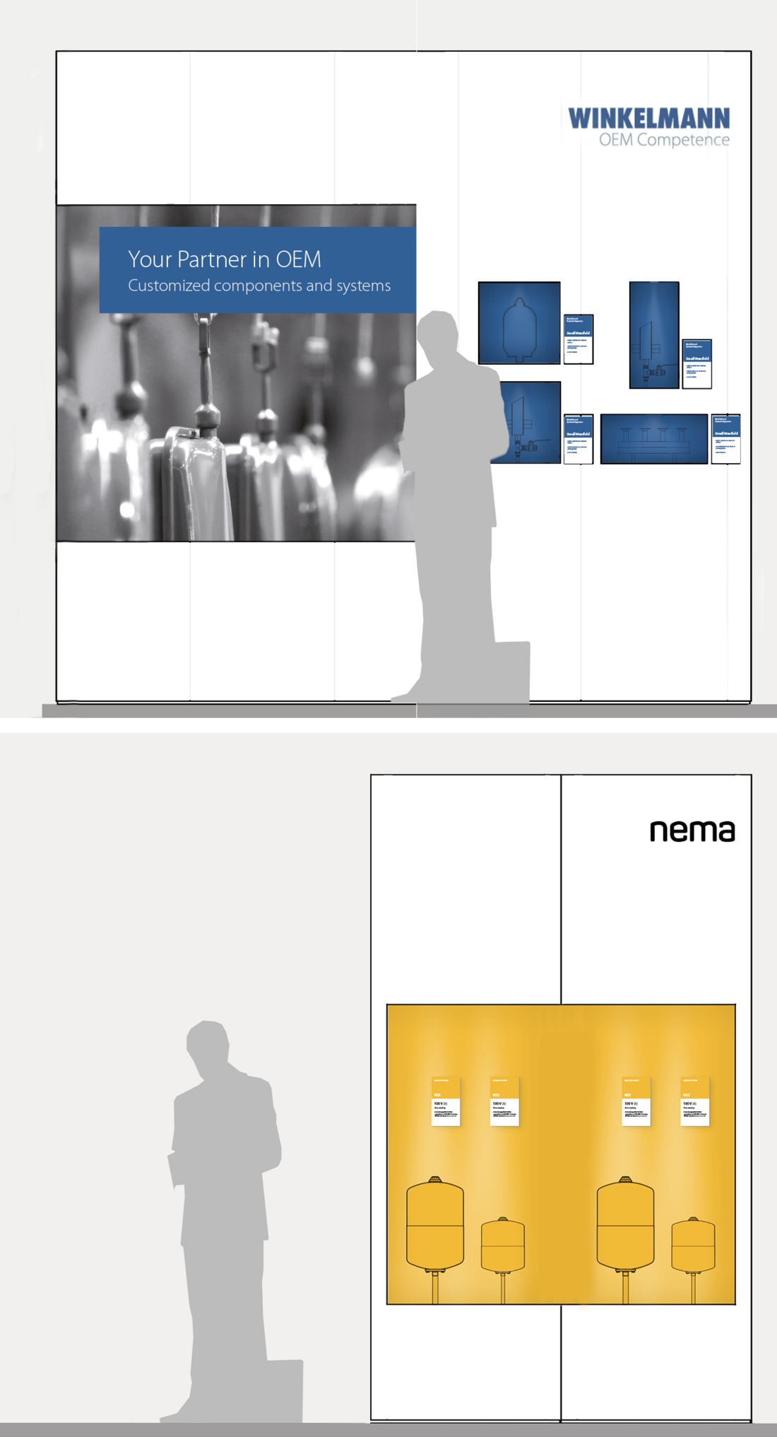
If other products from our business portfolio such as nema or Winkelmann OEM Competence are included on the stand, the logos for these brands are to be positioned below the Reflex logo in the order Reflex – nema – OEM.
Level 2: Overall theme
Reflex City
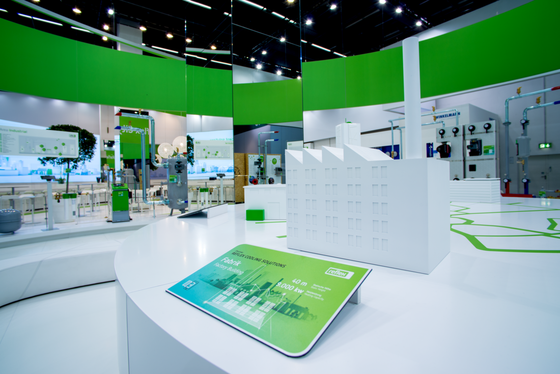
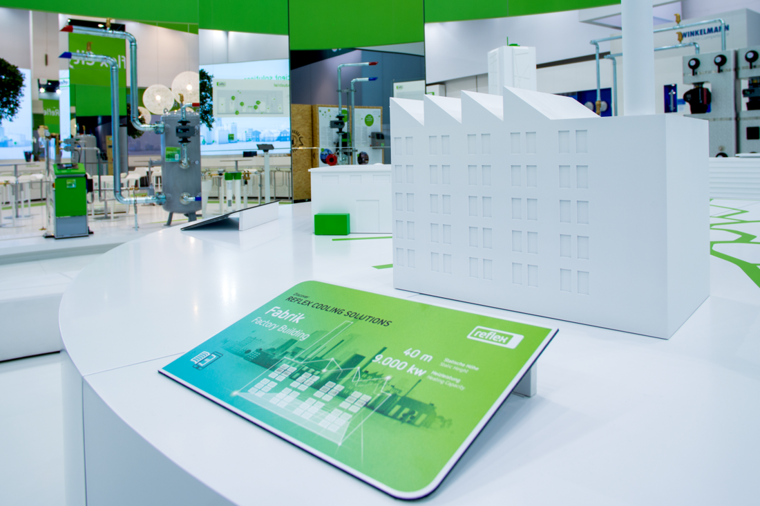
Reflex City reflects how we see ourselves. We can offer products and solutions for systems of all sizes and complexities. It is impossible to imagine Reflex City without our solutions and it must therefore never be presented without our products. It is the overall theme of every trade fair stand.
Level 3: messages
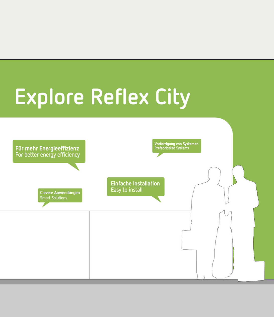
Explore Reflex City
Reflex City is Thinking Solutions in action. Text-based messages invite visitors to discover Reflex City: Explore Reflex City goes hand-in-hand with our overall theme. It is the most important message on the stand. Experience the vast range of opportunities offered by our products and solutions!
Trade fair graphics broadcast our Explore Reflex City message in an eye-catching way, high above ground level. Trade fair ceiling rings are particularly useful due to their location. In addition to Explore Reflex City, we also use
supporting messages, including:
- High quality products and high technical level (“reflex+” portfolio)
- Energy-efficient and innovation-driven for end customer comfort
- Solutions provider for heating / cooling / water and for Residential/ Commercial/ Industrial with wide range of products and options
Level 4: products
Quality commitment
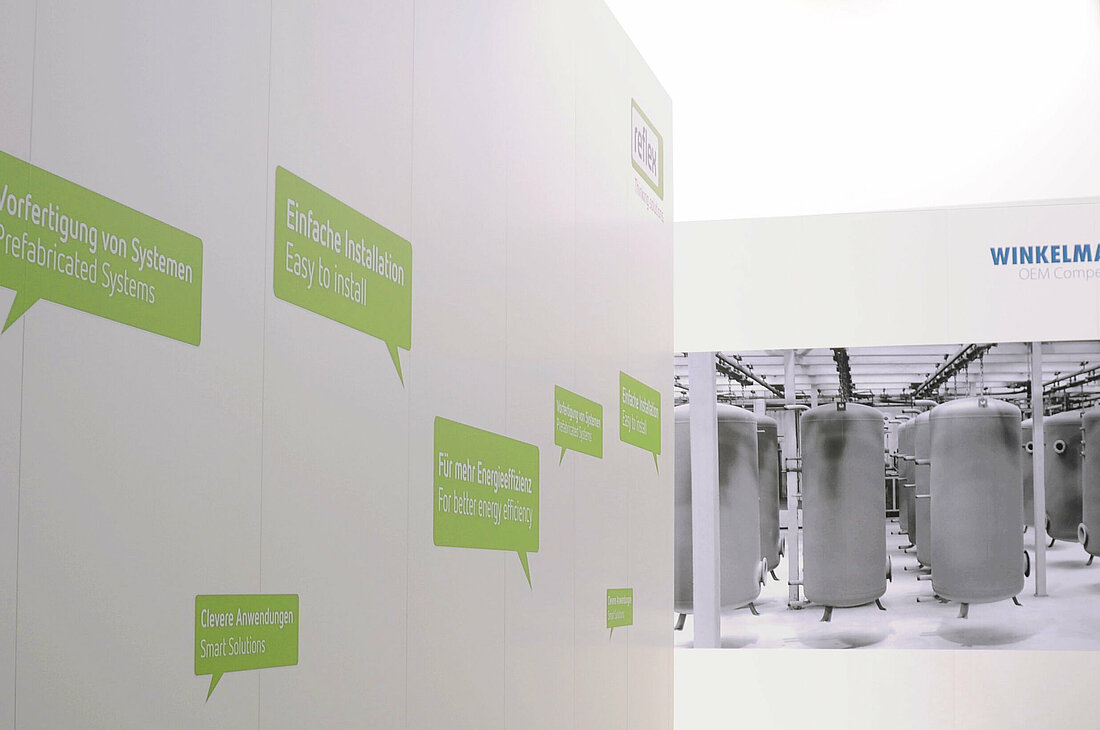
Our commitment to quality is communicated in catchy slogans:
- Prefabricated systems
- Greater energy efficiency
- Clever applications
- Easy installation
We have designed these quality commitments as statements in green speech bubbles. After all, they are the topics that underpin Reflex City.
Product information
The detail is provided at the lowest information level: this is where we communicate the USPs of the products on display. Please ensure you find the right balance between information and legibility here. It is the product information that clarifies what is special about our products in the hustle and bustle of trade fairs.
Design
Colours
The colour palette for trade fair stands is the same as our corporate colours (see section Colours for definitive specifications) – with an obvious emphasis on Reflex green. This will ensure the stand is clearly identifiable as a Reflex stand from a distance. The emphasis on Reflex green can also be increased by using the green frame as defined in the section Advertisements.
Small exhibition elements
Versatile wall elements in a concrete-style finish
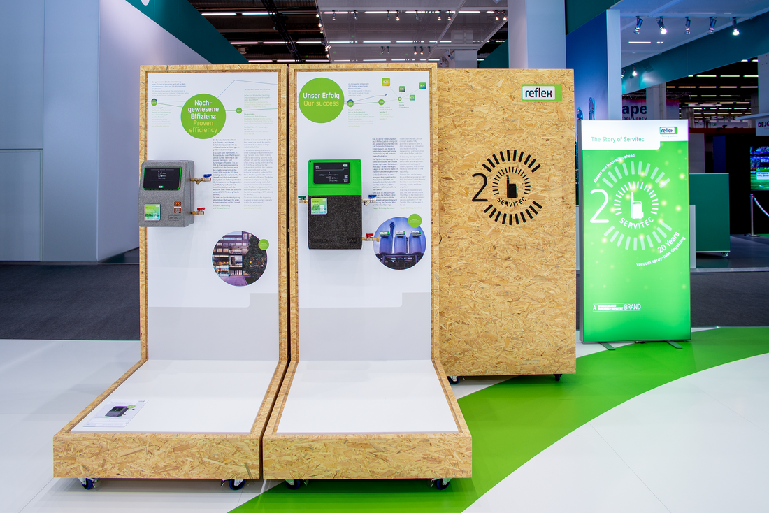
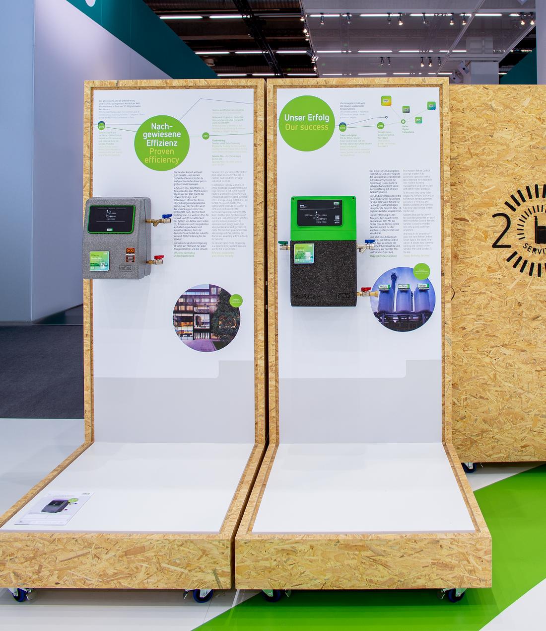
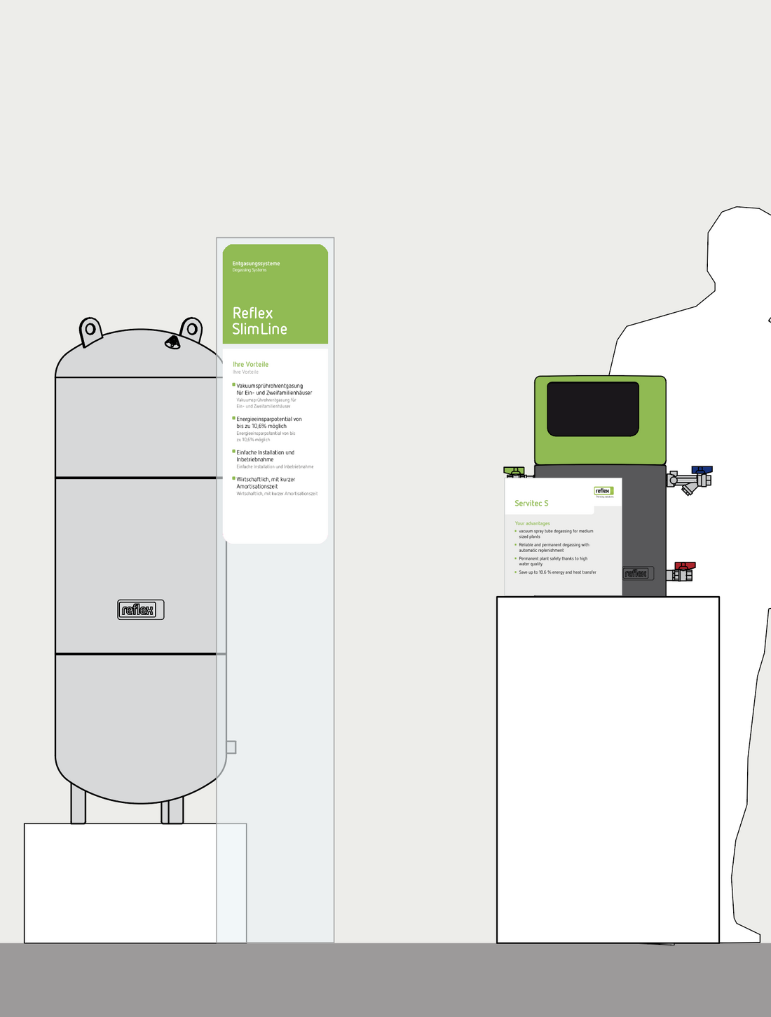
Versatile wall elements are ideal for small exhibition stands up to approximately 12 m2. They can be used either single- or double-sided for graphics or display products. They are best suited for presenting smaller products for the residential sector.
- Which product line is being displayed? That is communicated with header boards.
- Boards with more information are available for all portfolio segments.
- The individual products are captioned with vinyl film decals.
Product boards
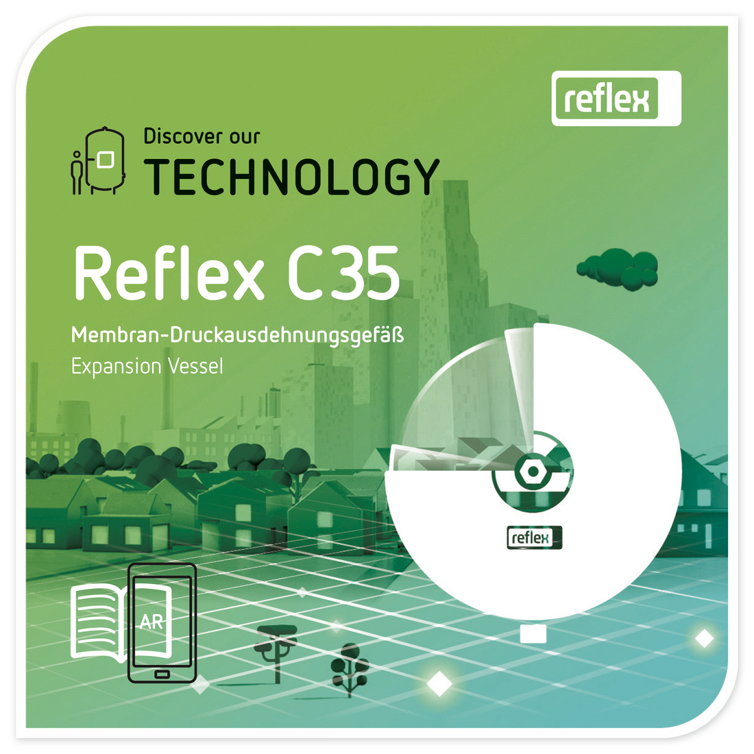
What does a product board contain? The name of the displayed product and the most important USPs. The design of product boards also follows strict rules: the base line of the first line of the headline is always the same as the right-hand upper edge of the grey background. The hook extends downwards for headlines with more than one line.
There is a separate template for multi-lingual applications: (generally bilingual: the language of the country the trade fair is held in plus English).
Transparent stands
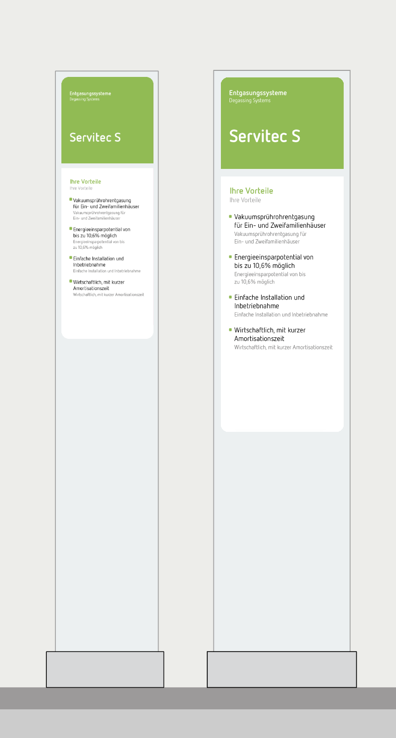
The transparent stands have the same information as the product boards. The name of the product and the most important USPs. The transparent stands come in two parts. The header, which is green so that it stands out from a distance, contains the product line and product name. The essential product USPs are listed in the lower section.
On bilingual boards, the languages are clearly differentiated through the font size and colours.
Sector boards
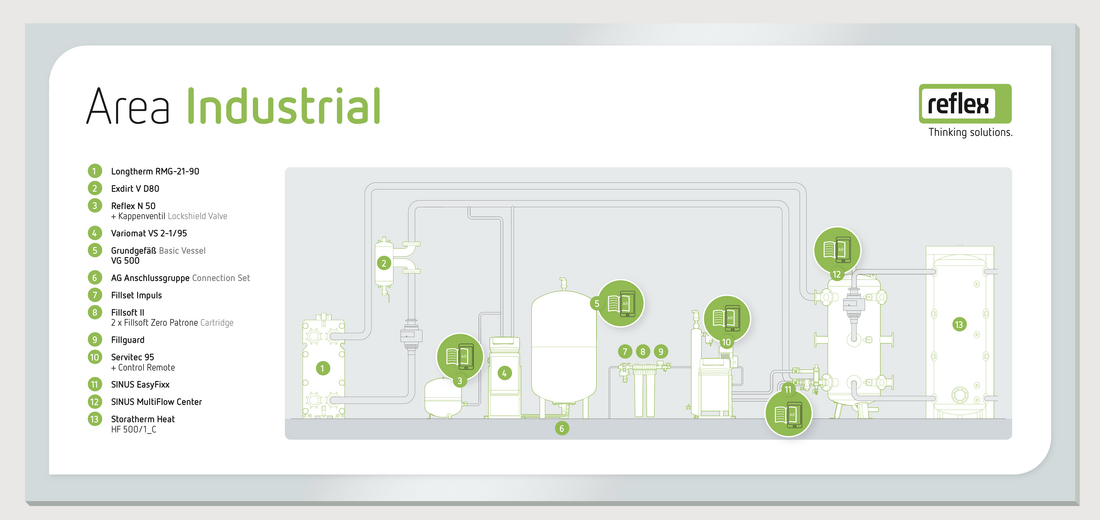
A sector board is used where a typical product configuration for one of the three large sectors is presented at a trade fair. It shows the displayed products with pipework. Benefit: this allows you to present a typical installation situation. The sector board can also be included in the Smart City AR app: just mark the relevant products on the board.
Integration of other brands
Please ensure the following when several WBI brands are used together on a shared stand:
- as far as possible, ensure individual brands are communicated in separate areas on different island units.
- that all brands are always presented in accordance with their own corporate design. Details of the design specifications can be found on the Winkelmann OEM Competence page or in the nema Corporate Design Manual.


