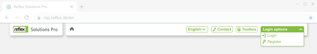
Header
Headers are always composed as follows: the logo on the left, then, from left to right, the navigation lines (bread crumbs), language settings,quick access contact and the toolbox. On the far right are the login options which vary as follows:
Structure when not logged in
Dropdown options for Sign in or Register. Please make absolutely certain that these terms are clearly differentiated from each other in the relevant language (see example below in English).
Structure when logged in
Logged in users can view and edit their specific user data on the right under My account.

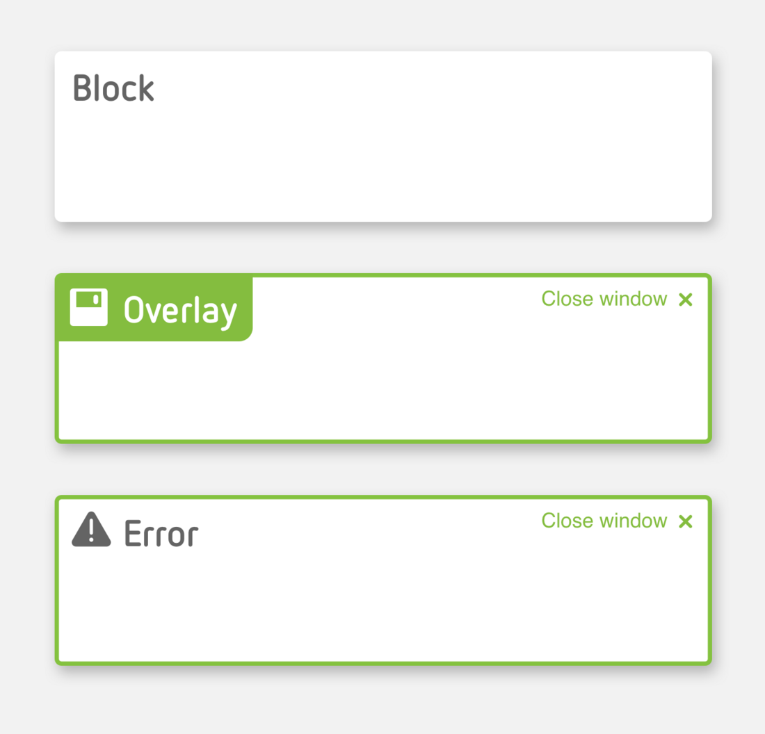
Blocks
Reflex Solutions Pro is made up of various different blocks. These blocks each have a specific meaning in terms of content. They also cluster information and data visually. The height of a block is governed by the amount of information it contains.
1. General blocks
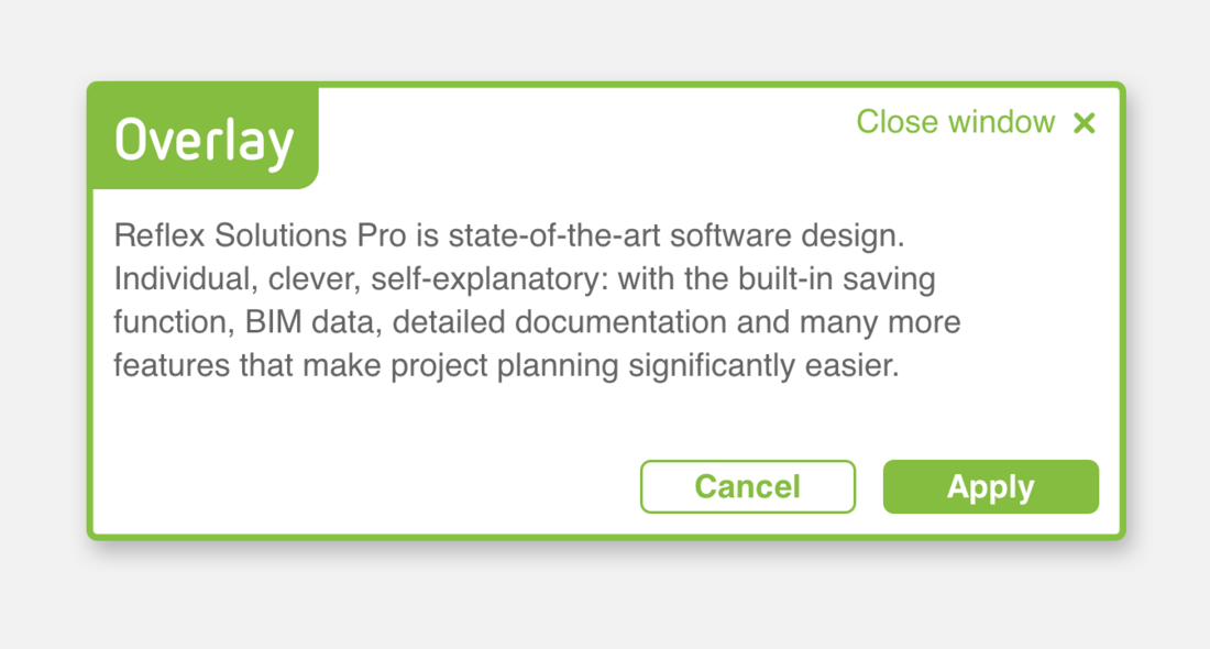
2. Overlays
3. Fault messages
Please note the special Marketing Banner block mentioned above in the section Home page.
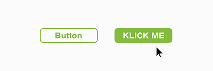
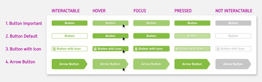
1. Solid button
This button has particular emphasis as it is a solid green. It grabs the user's attention. These highlighted areas should therefore be used sparingly.
2. Button with border
Standard buttons have a border. They indicate actions available to the user on this screen. The preferred action however is indicated with a solid button.
3. Button with icon
In addition to the solid buttons and buttons with border (1 and 2), an icon can also be added to a button. The icon is an additional indicator for the action that will executed by clicking the button. The icon's colour is determined by the text colour in the button.
4. Arrow-shaped button
Arrow-shaped buttons are used where clicking on the button will execute an important action and will take the user to a new screen: next! Arrow-shaped buttons can also be combined with an icon (icon colour is determined by the text colour), Please note, arrow-shaped buttons also come in two variants, solid and with border.
5. Input field
Input fields are provided for all numerical and text entries made by the user in the program. If there is a unit for the value, it is shown on the right.
6. Combo box
Combo boxes provide the user with a choice of entries which cannot be edited, for example, because they have to comply with specific standards or standard values.
7. Dropdown menu
Dropdown menus allow the user to go directly to the required link.
8. Toggle Button / Switch
Toggle buttons are simplified check boxes where the user chooses between option A or B. These switch buttons are always binary.
9. Check box
Everything OK? Check boxes appear either individually or as a list. When in list form, the user can tick none, one or some check boxes.
10. Radio button
So-called radio buttons are used where two or more options are available for selection in a list which are mutually exclusive. The user can therefore choose only one option using a radio button.
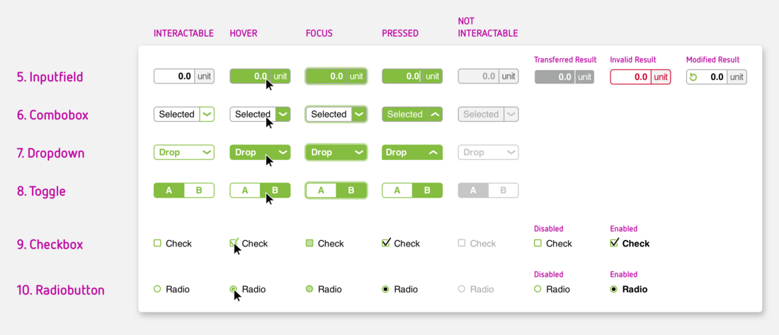
All modules have five different statuses or indicate a status of ...
- Interactable – the user can interact with the input module
- Hover – the cursor is now on an input module
- Focus – the use has selected the module with the keyboard
- Pressed – the module has just been clicked
- Not interactable – the user cannot interact with the module at this point
Toggle buttons, checkboxes and radio buttons also have the following statuses:
- Selected – the module has been selected
- Deselected – the module has been deselected.
There are four further special statuses for input field modules:
- Calculated result – the displayed value has been calculated from the data entered by the user or other data
- Transferred result – the displayed value has been transferred from the input or calculation in an overlay
- Invalid result – the value is outside parameters for permissible entries: the user should check the data
- Modified result – the standard value provided by the system has been modified by the user (and can be reset).